// DIRECTION 1 //
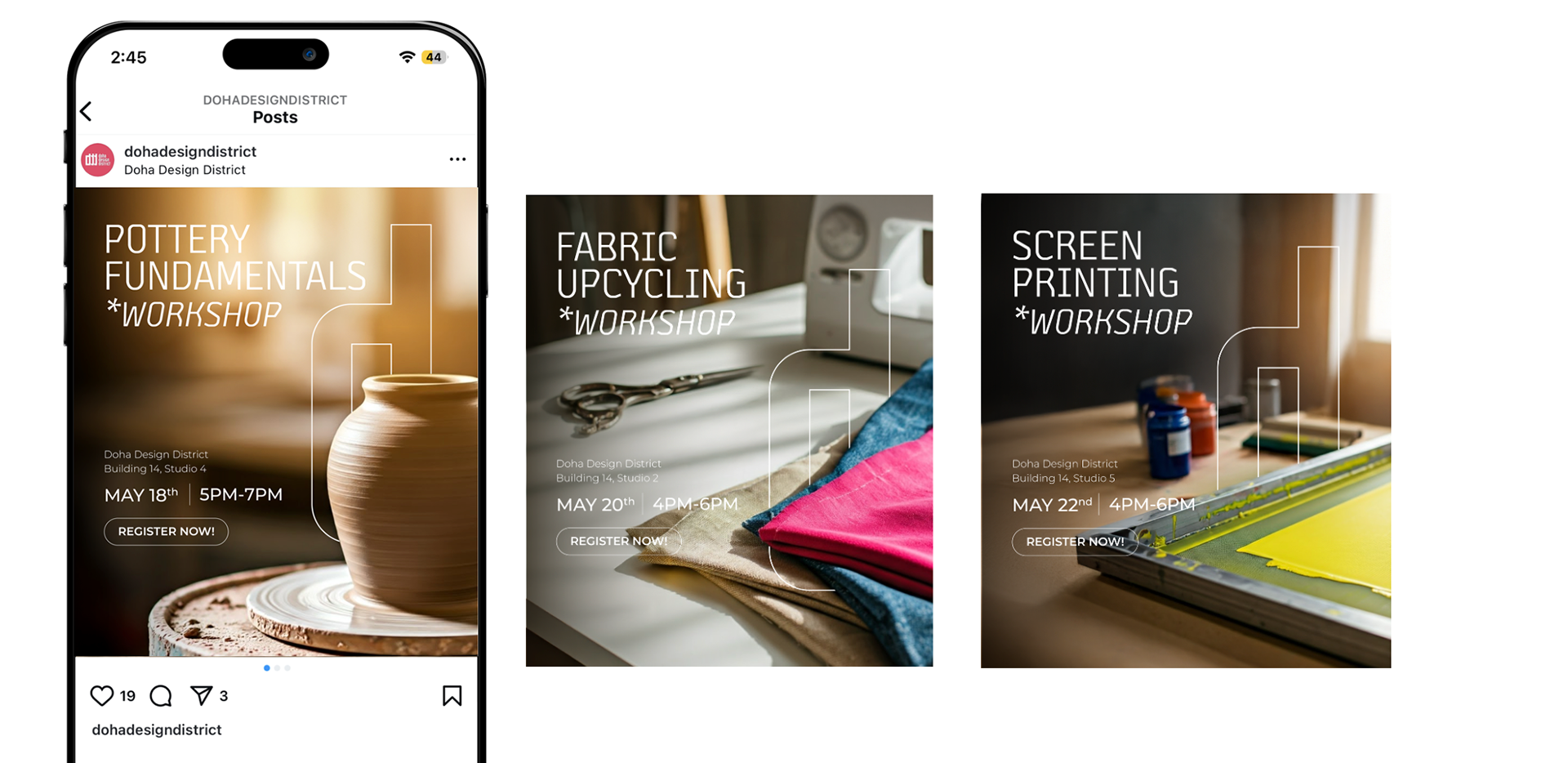
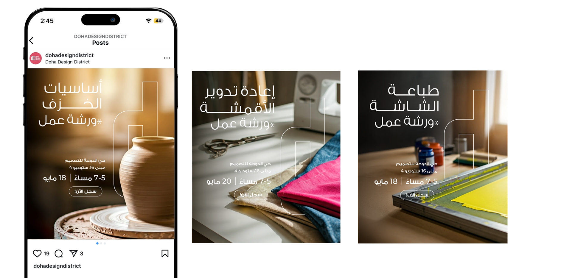
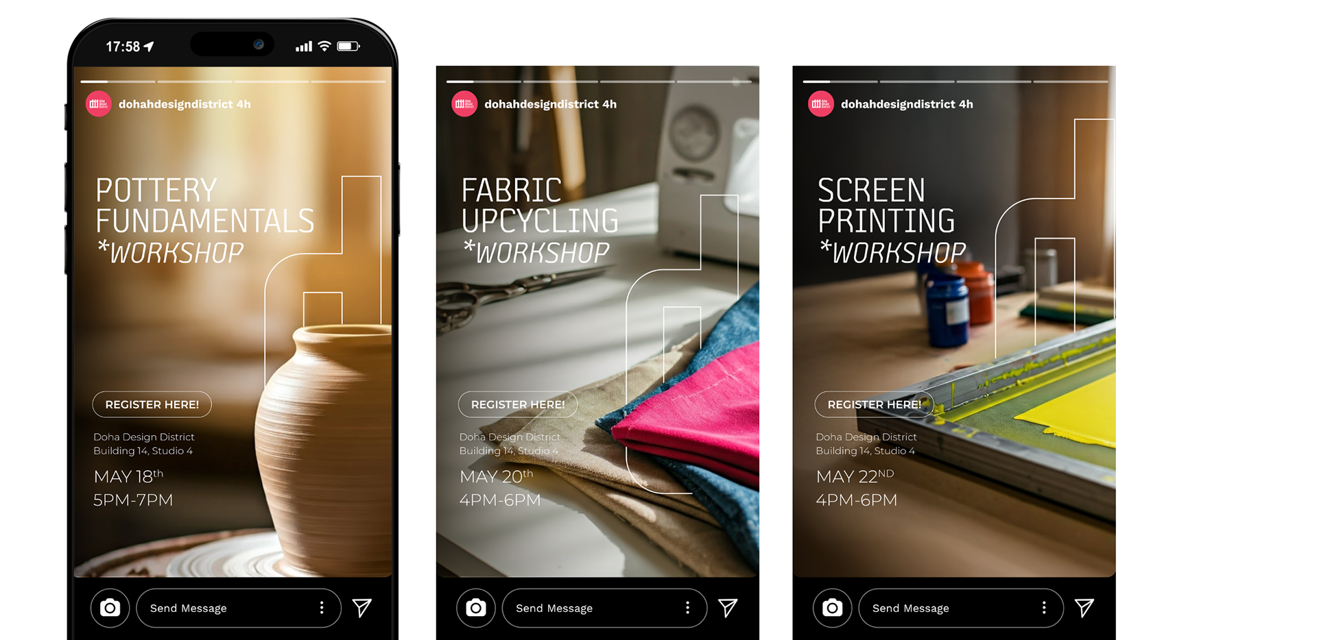
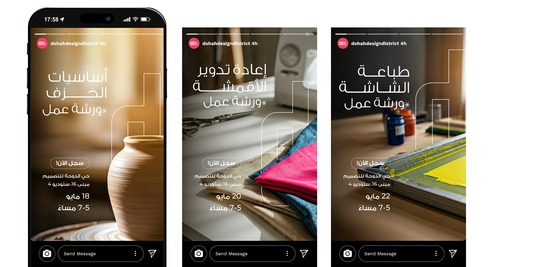
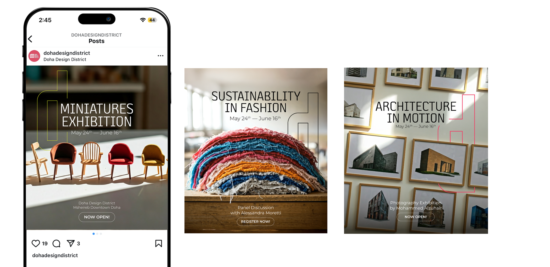
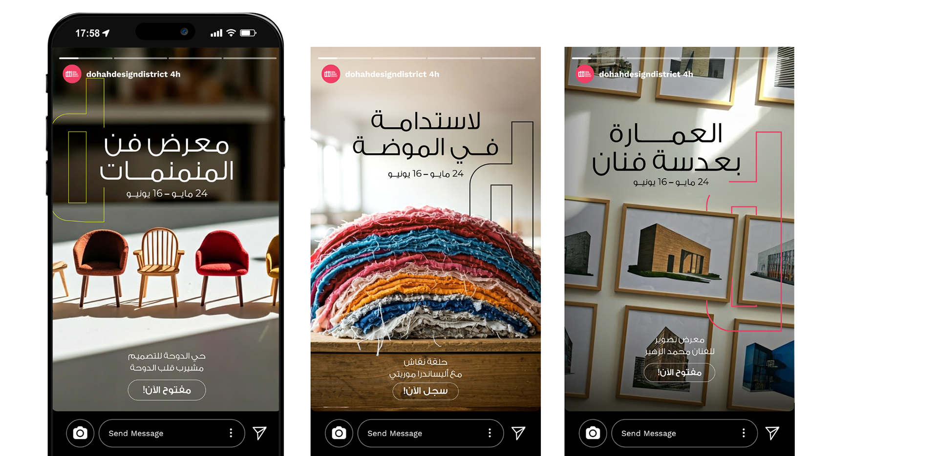
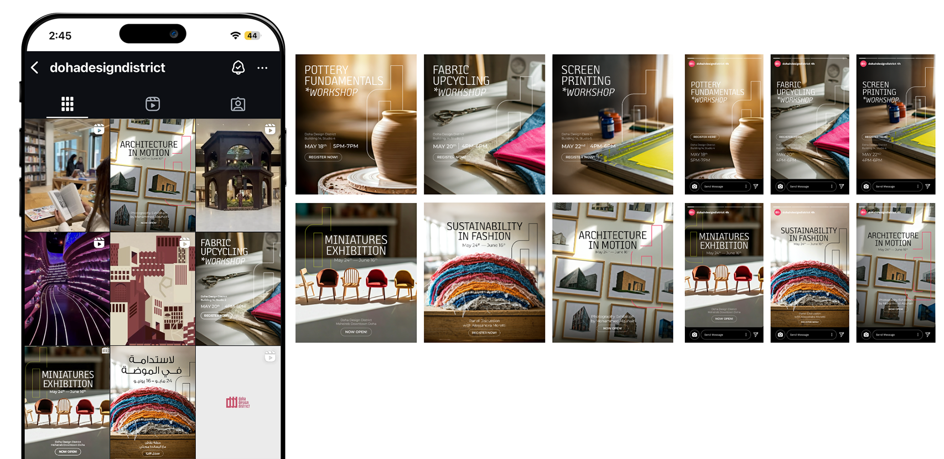
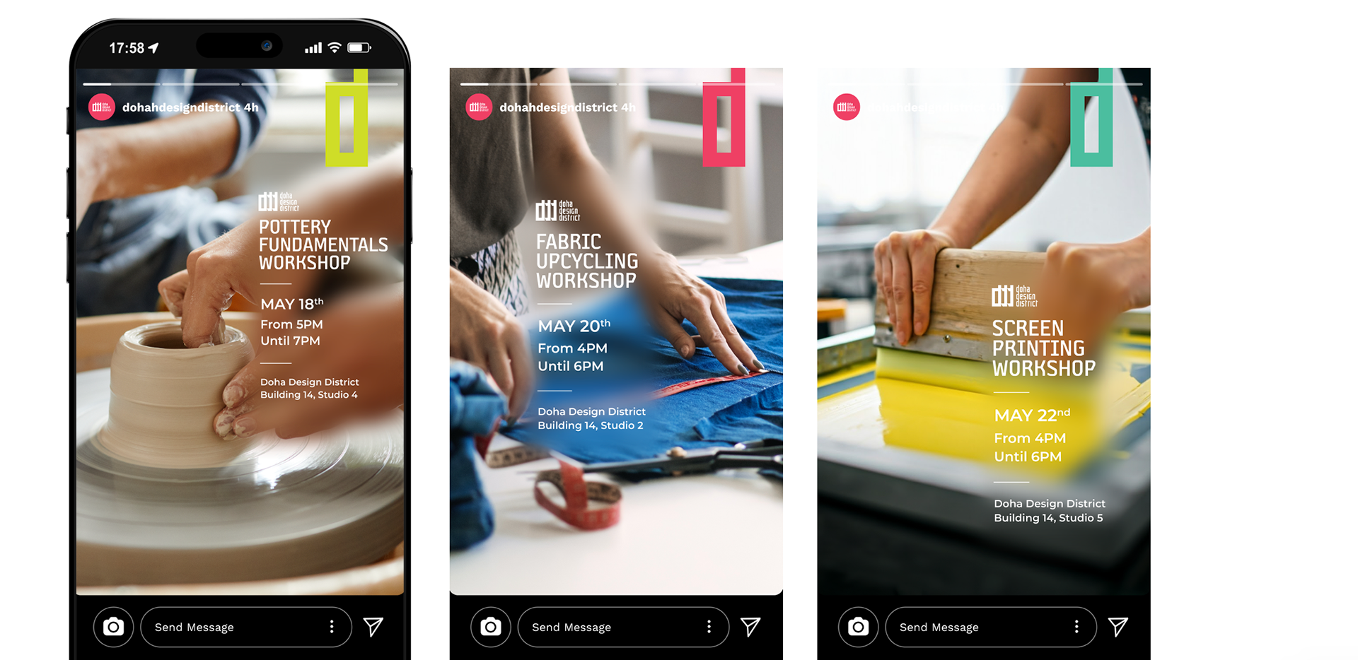
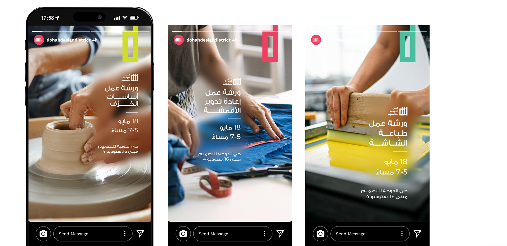
In this direction, we used an exaggerated yet subtle 'd' from the logo, interacting with each workshop or event's subject to emphasize unity and brand consistency. Because of how prominent the use of the 'd is, it negates the need for the full logo.
We focused on the core activity of each workshop/event by using close-ups and blurred backgrounds with warm tones to create a sense of welcomeness and attract the targeted audience
Workshops
Events
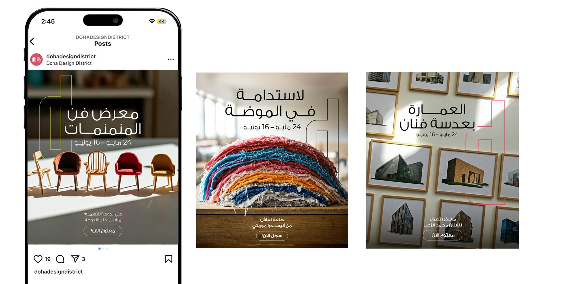
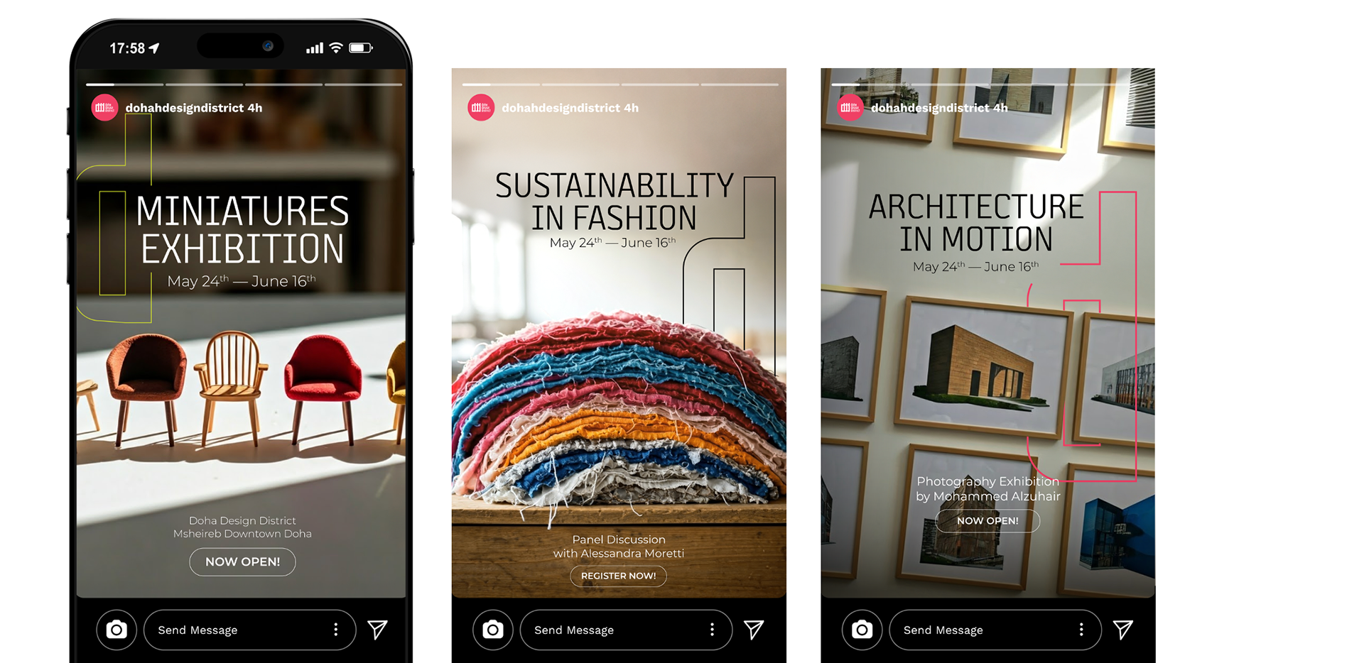
D1 Overview
// DIRECTION 2 //
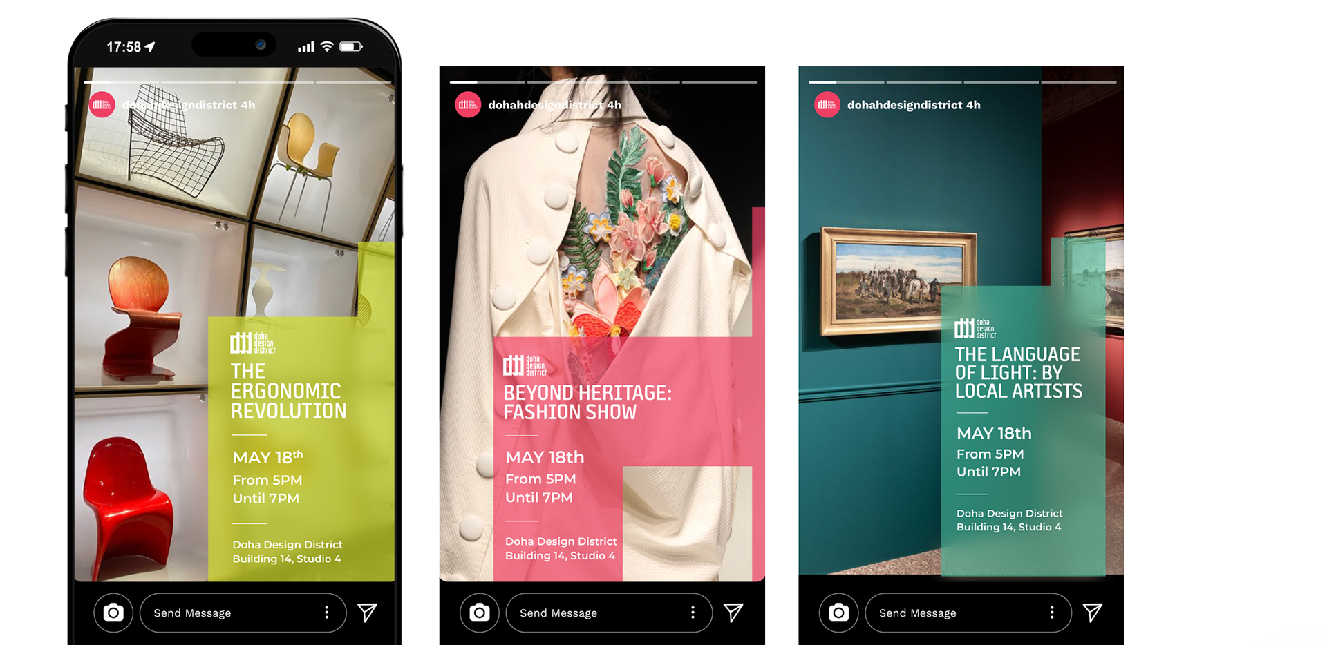
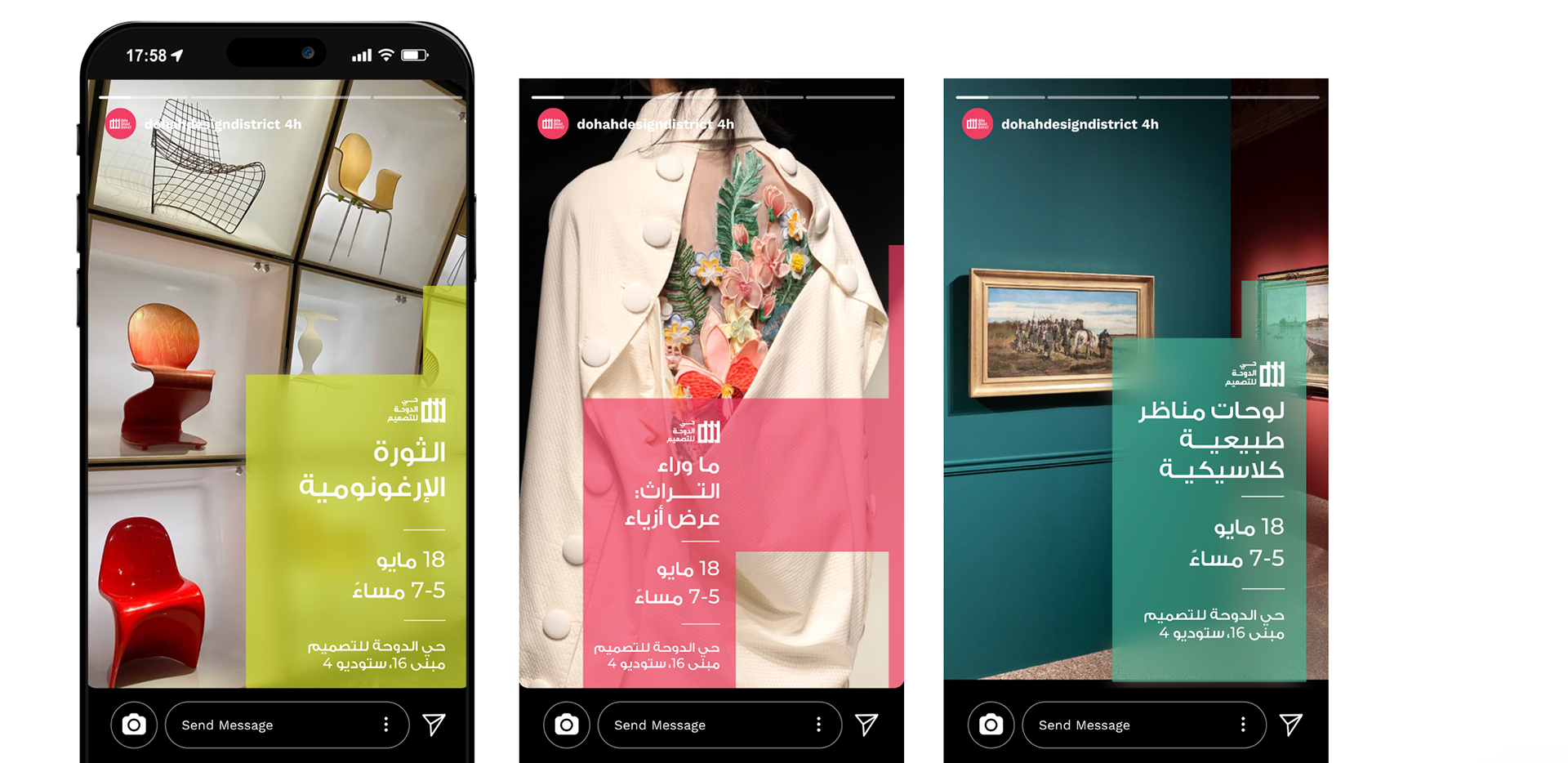
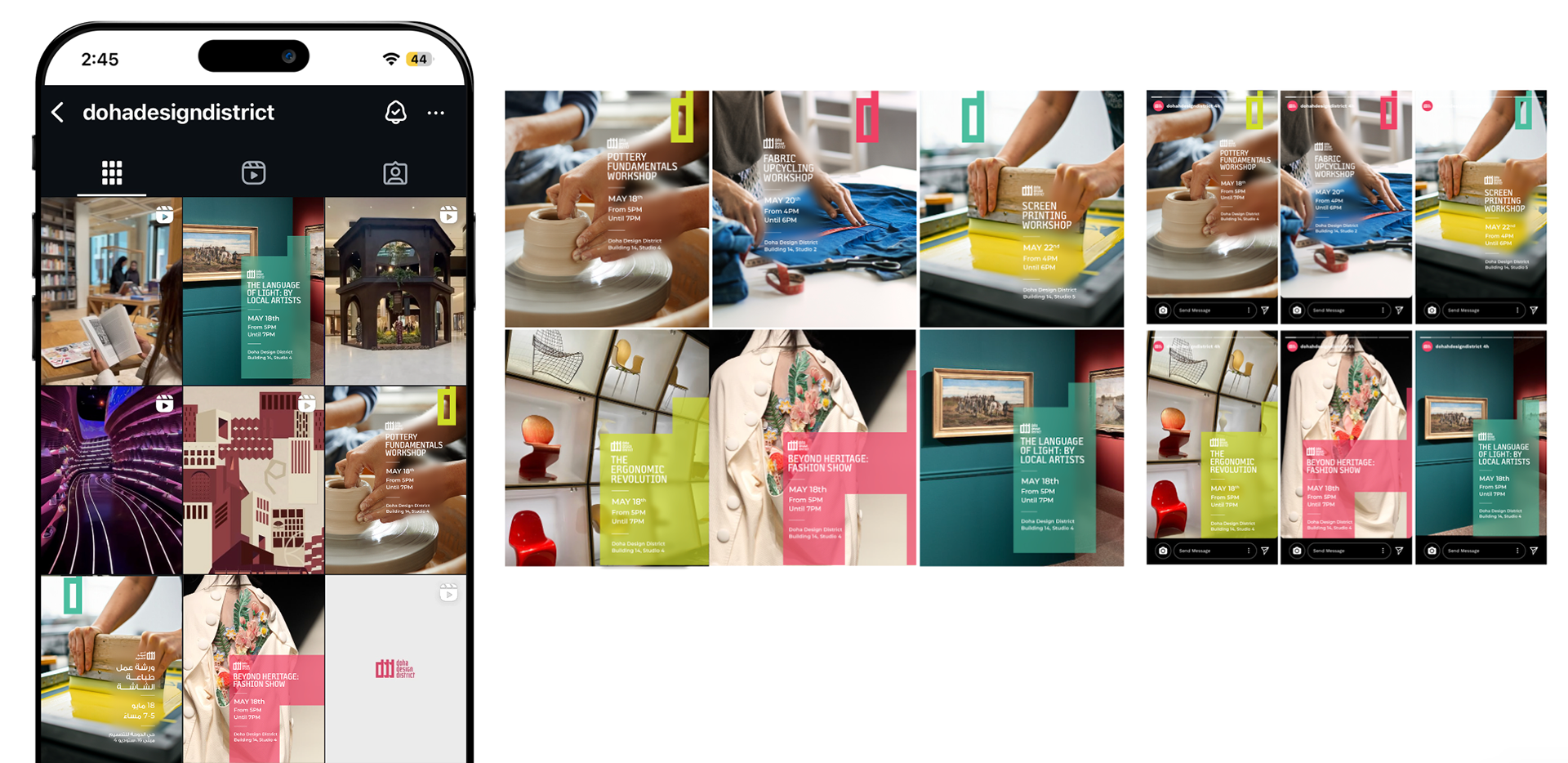
This direction uses a color-coded system through the use of the DDD emblem from the logo. This emblem acts as a 'bookmark' on the grid, allowing the audience to identity the categories of workshops easily.
The same color-coded system applies to events, but with adaptable scaling to allow flexibility in the template.
Workshops
Events
D2 Overview
// DIRECTION 3 //
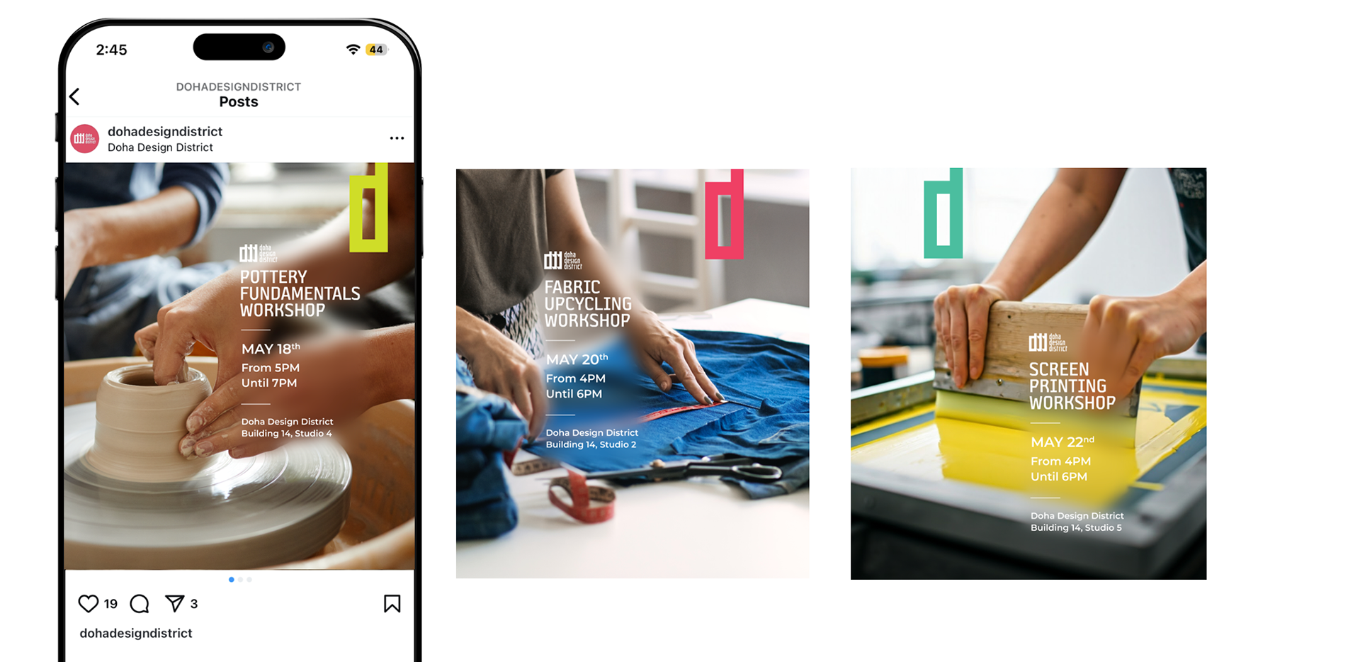
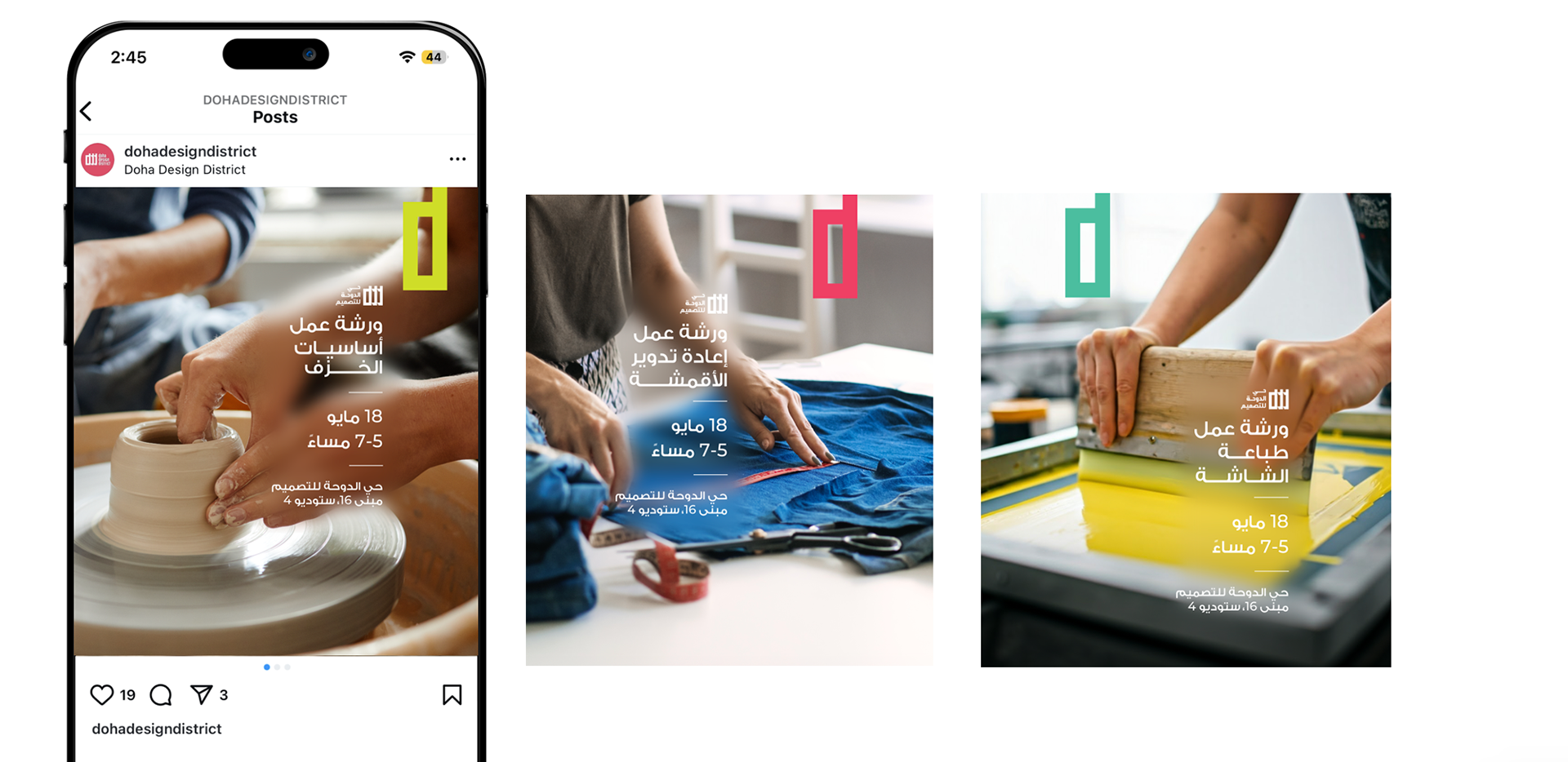
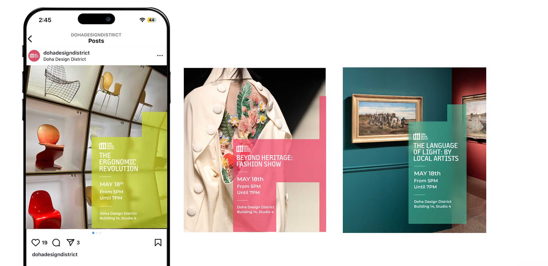
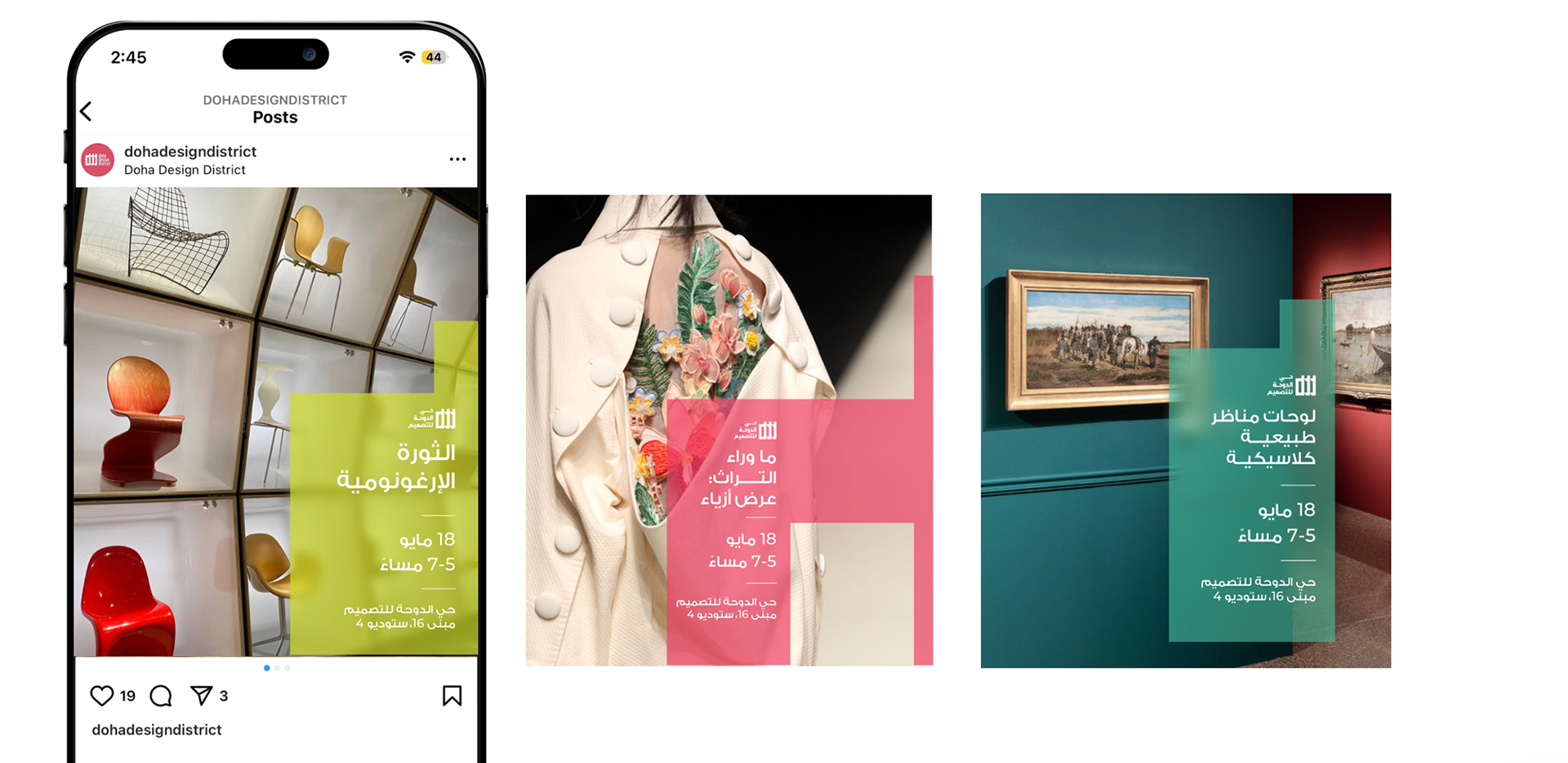
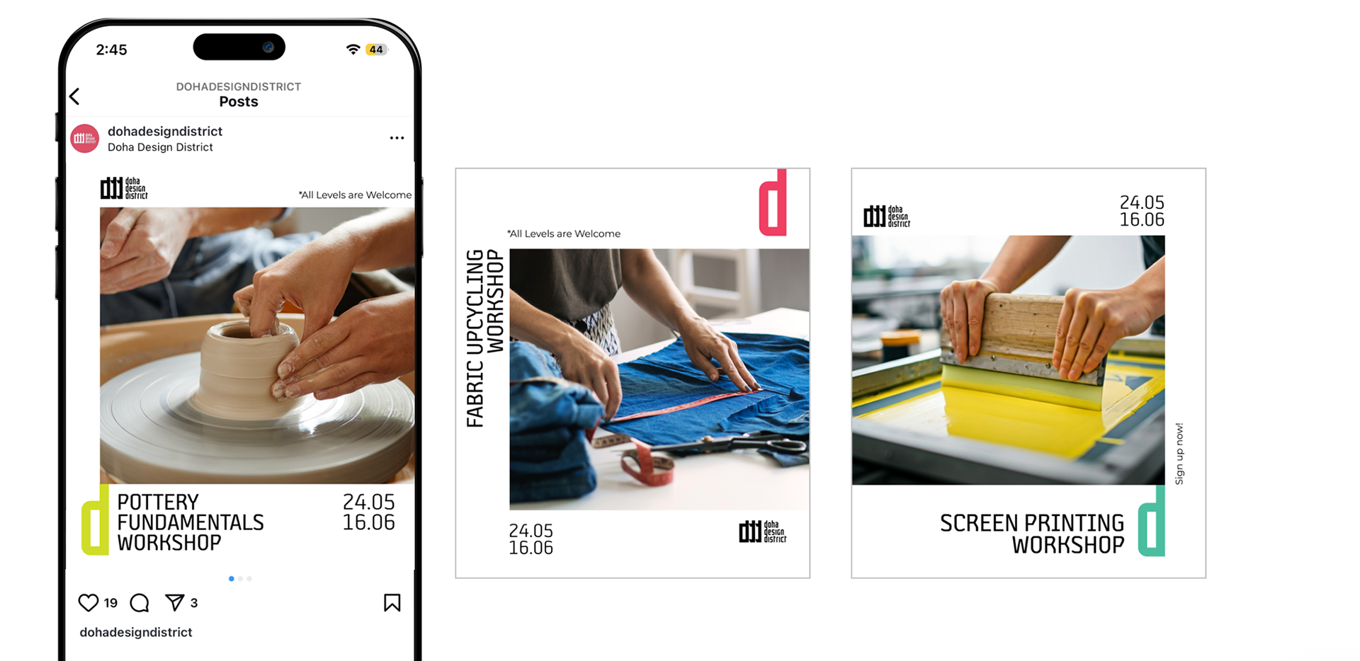
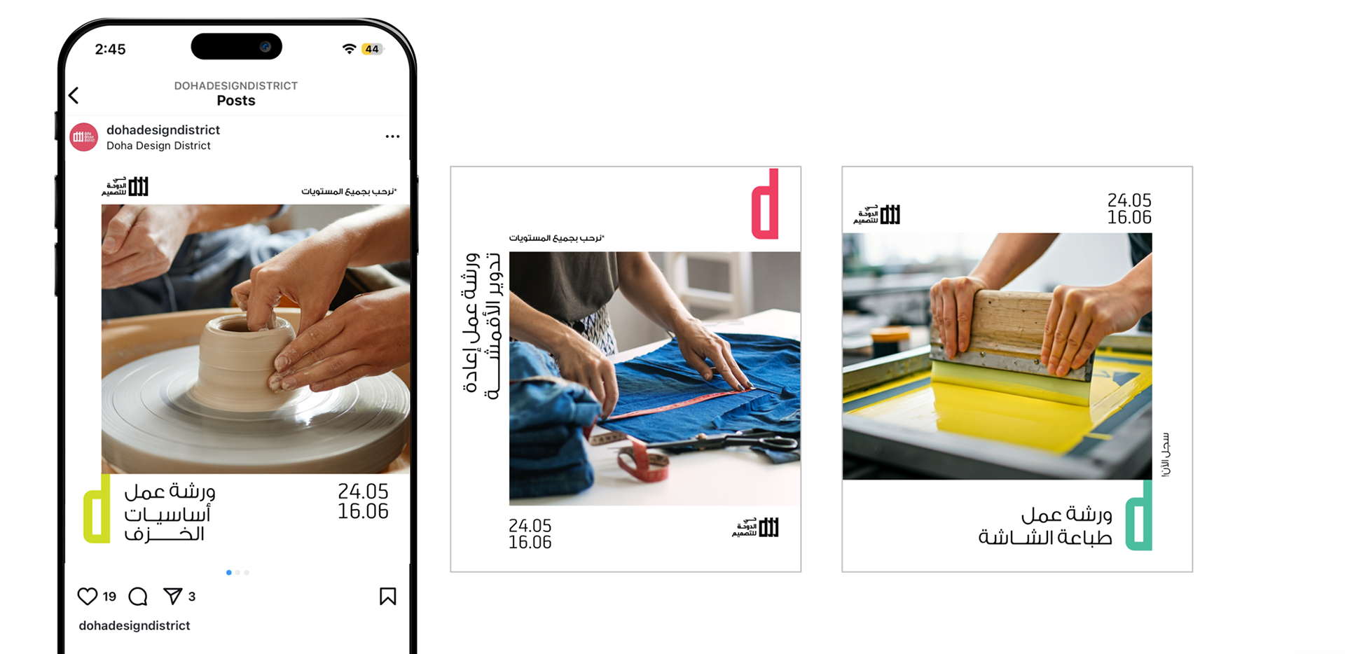
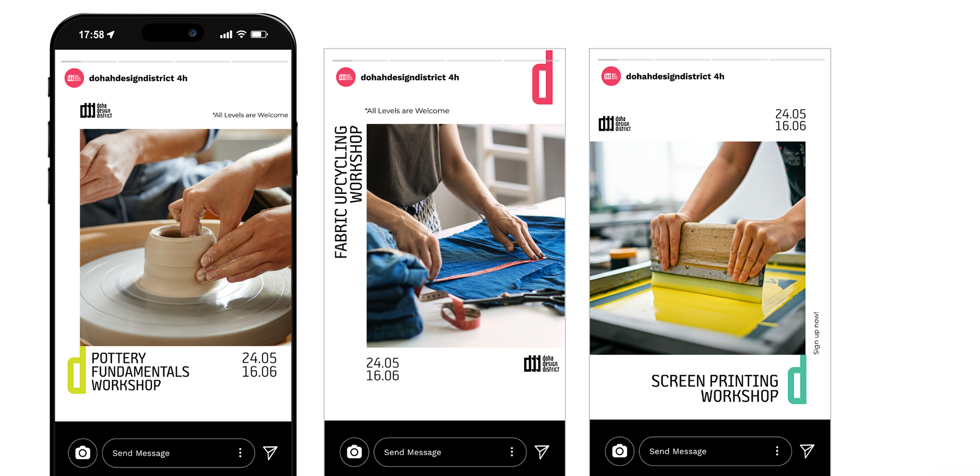
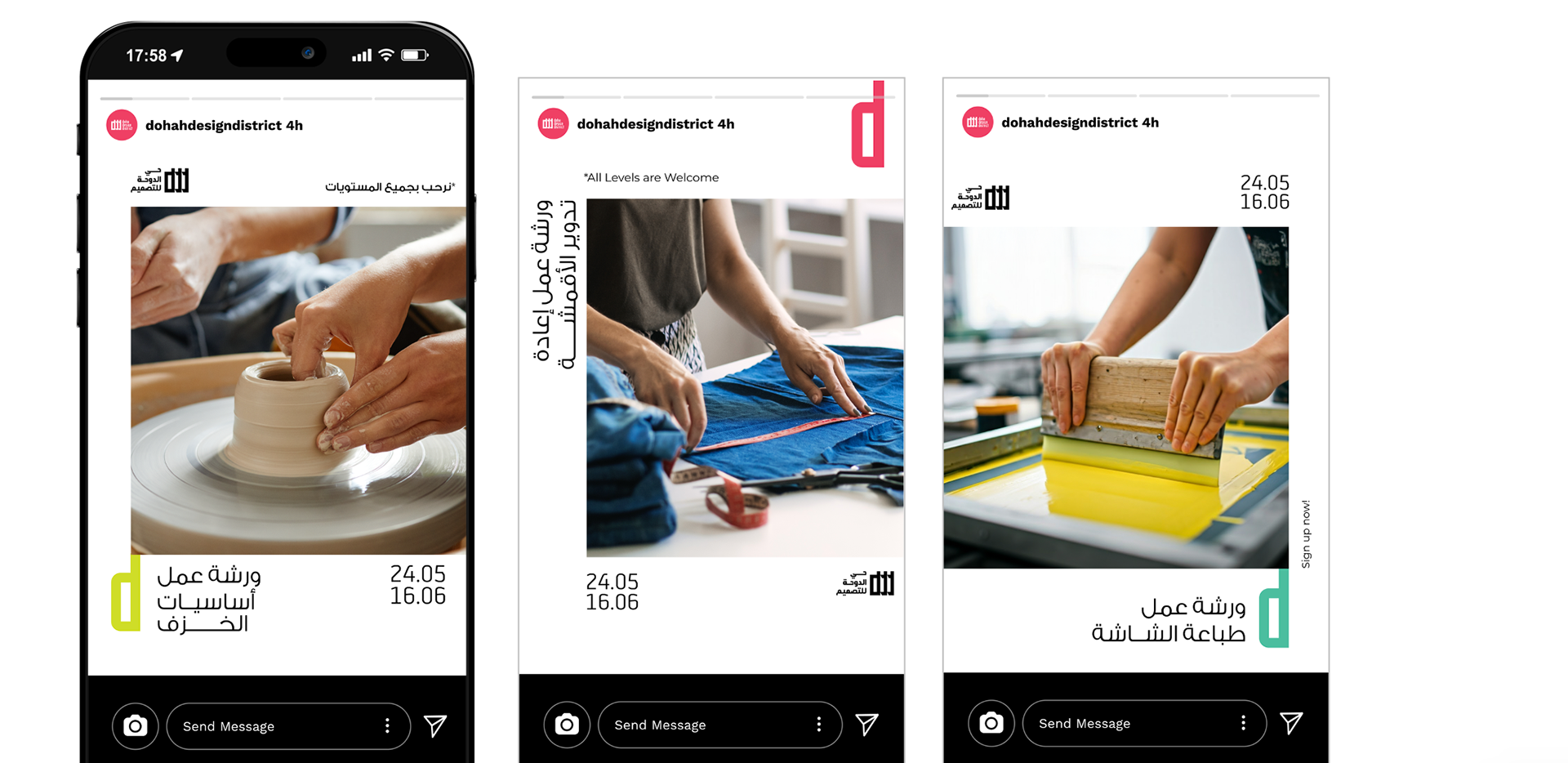
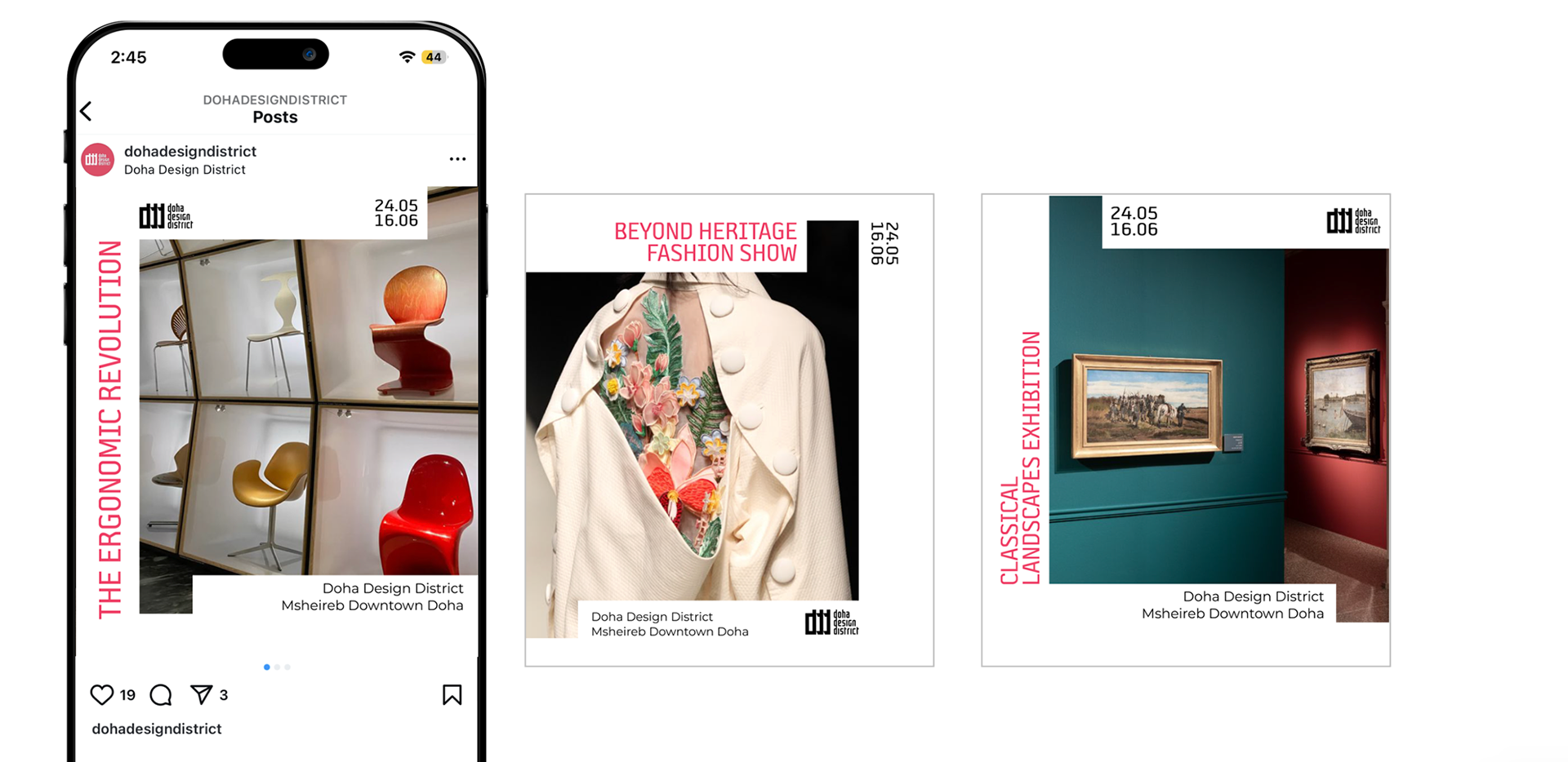
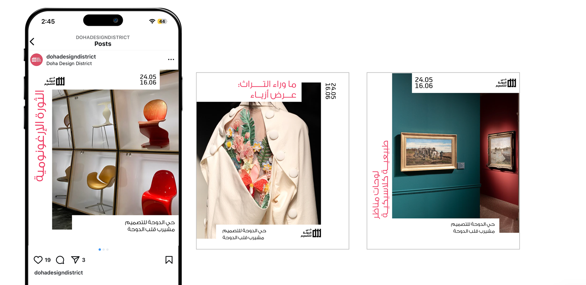
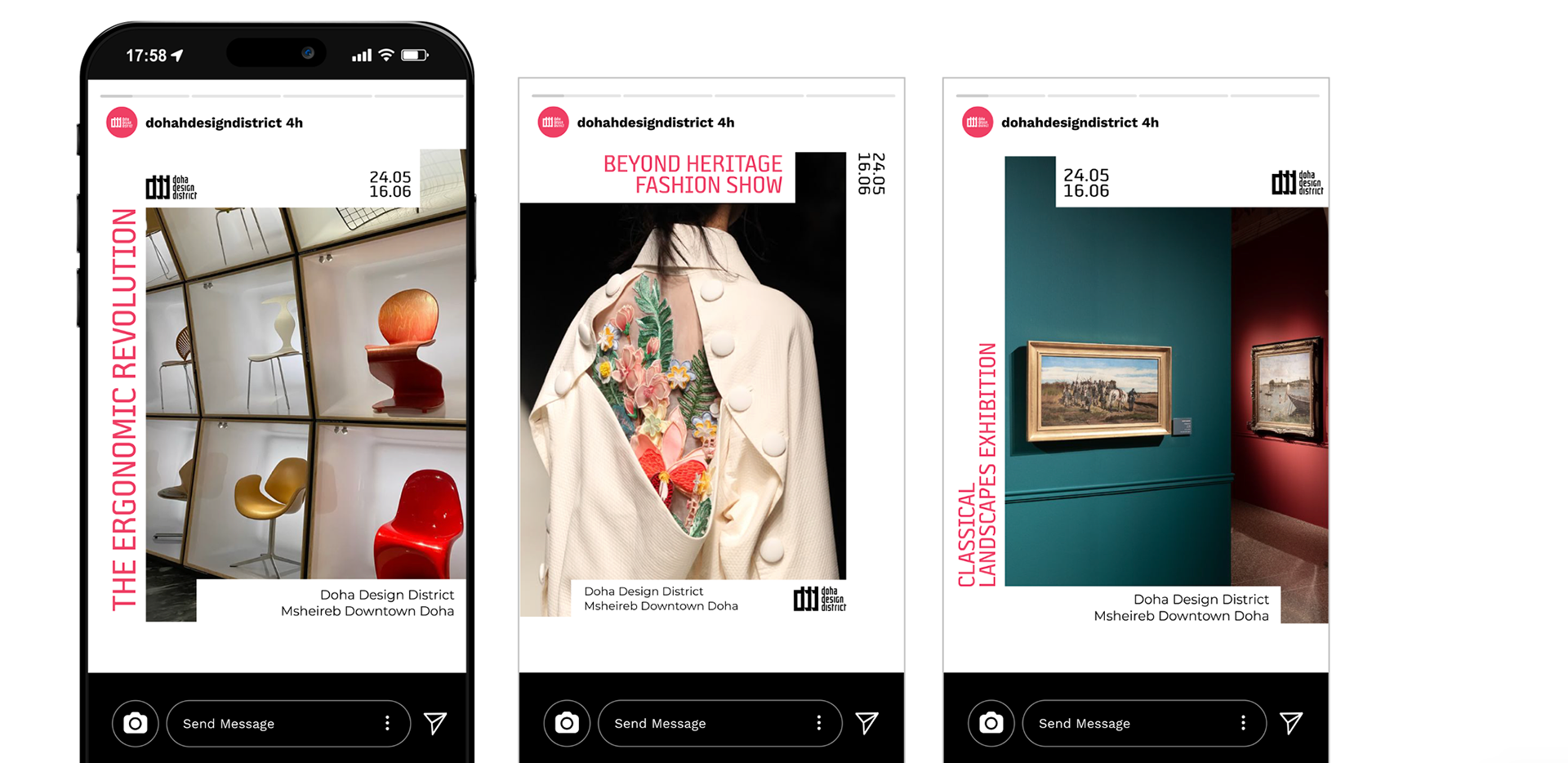
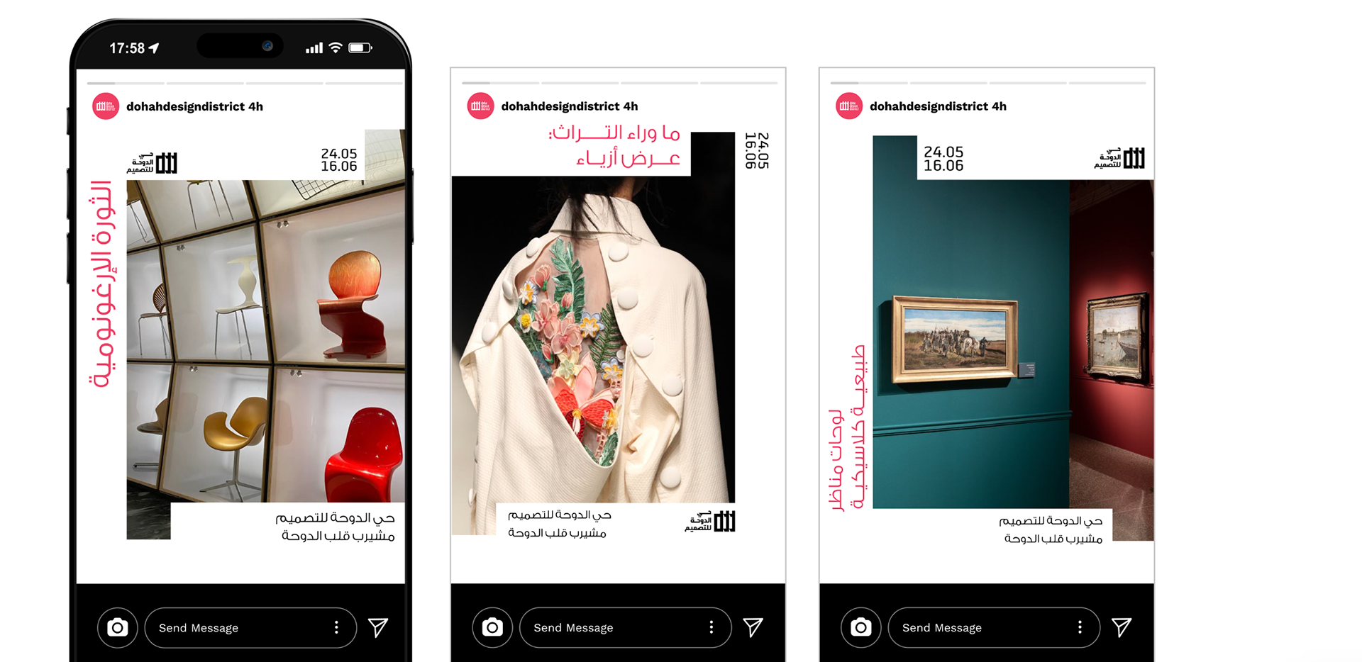
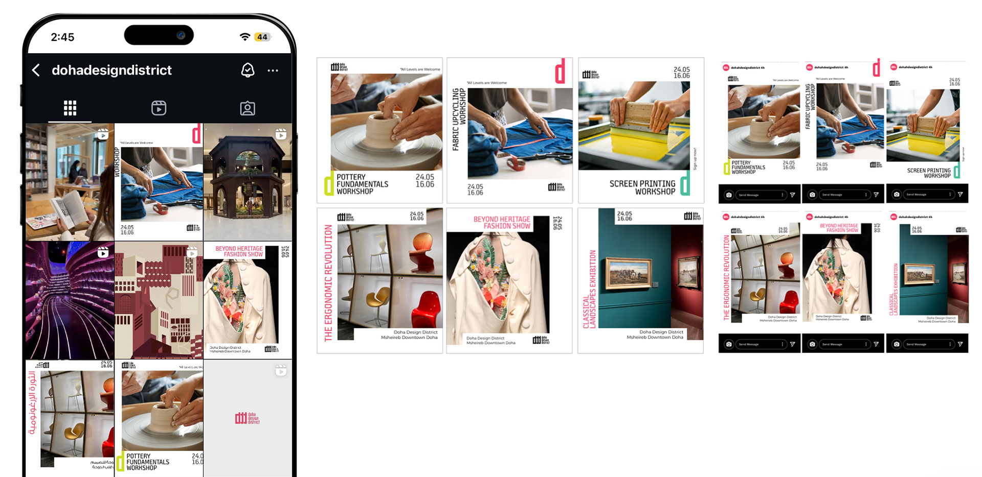
This direction maintains the same color-coded system but with the letter 'd' from the logo instead. We prioritized visual breathing room, ensuring focus remains on the image and headline. It's a minimalistic yet playful approach, offering layout flexibility while adhering to DDD's brand guidelines.
To distinguish events from workshops, event images adopt the emblem shape from the previous design, providing both flexibility and structure within any composition.
Workshops
Events
D3 Overview
// DIRECTION 4 //
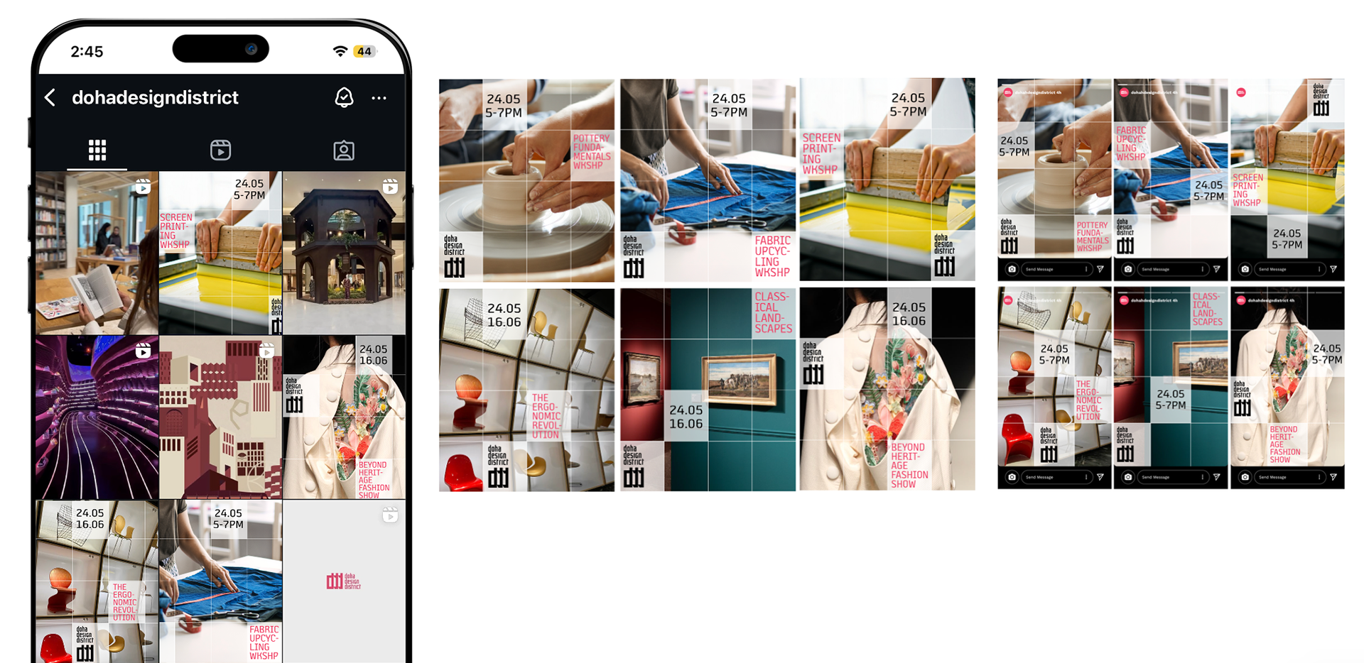
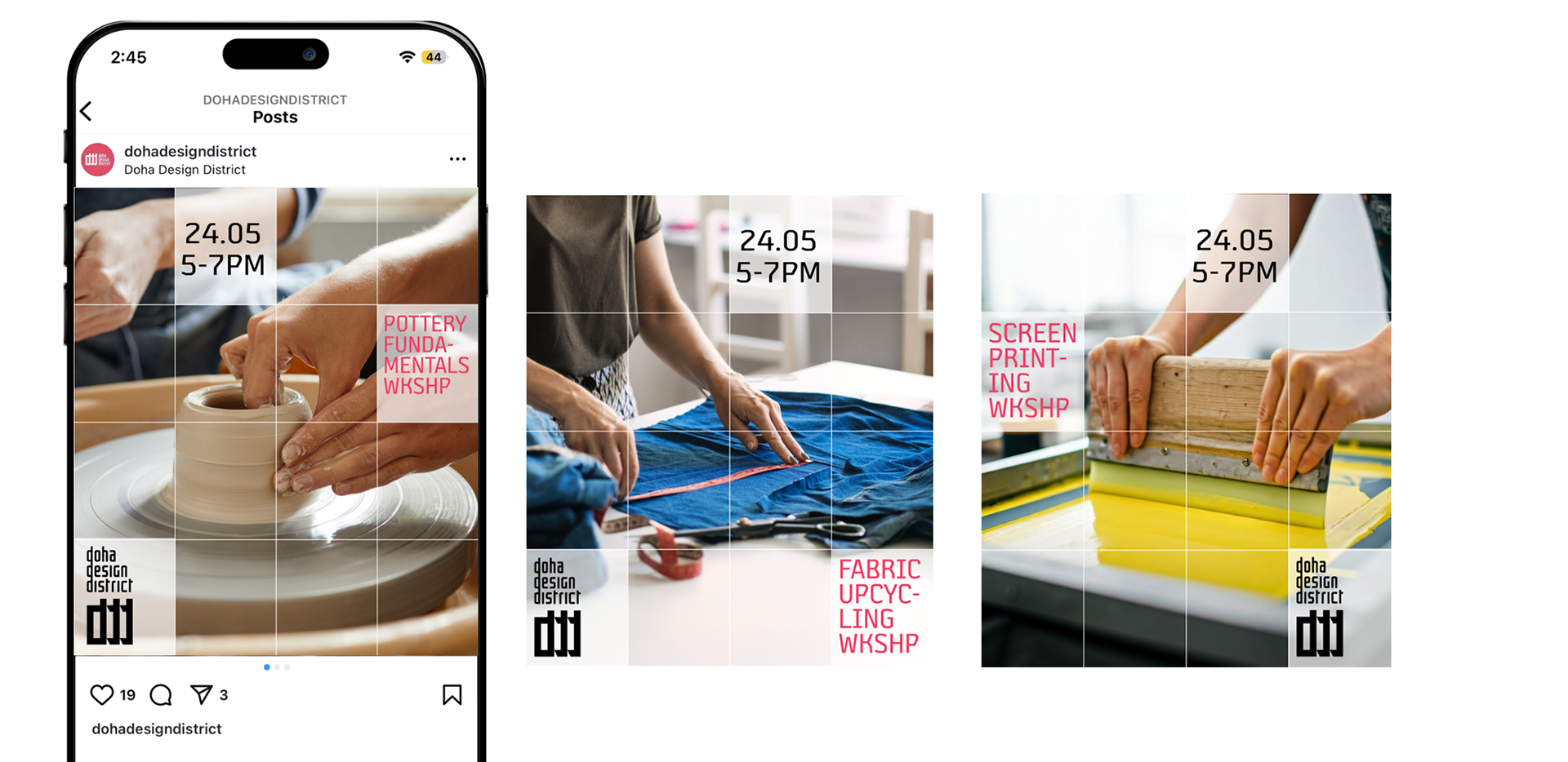
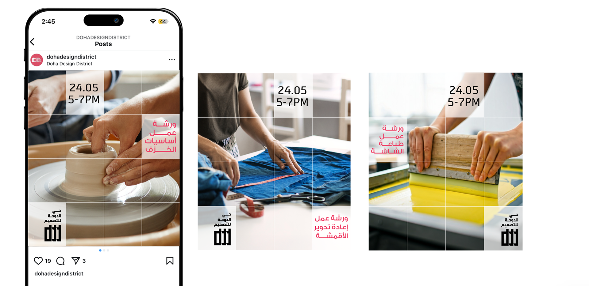
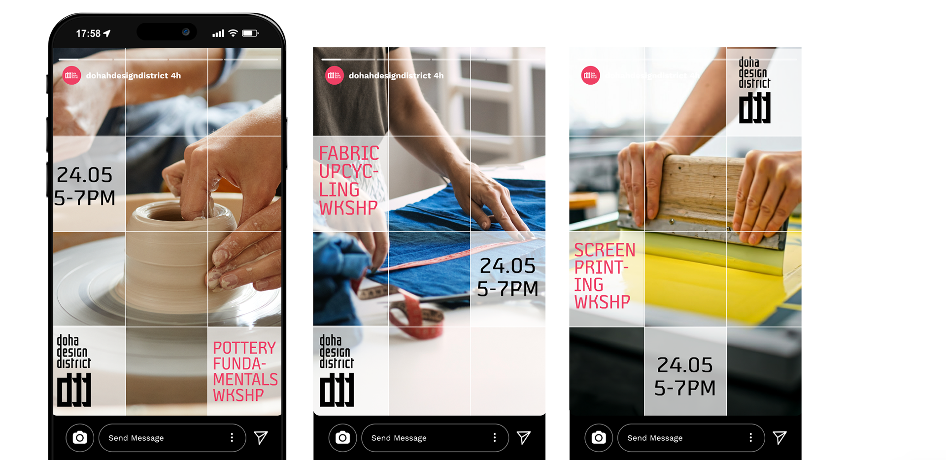
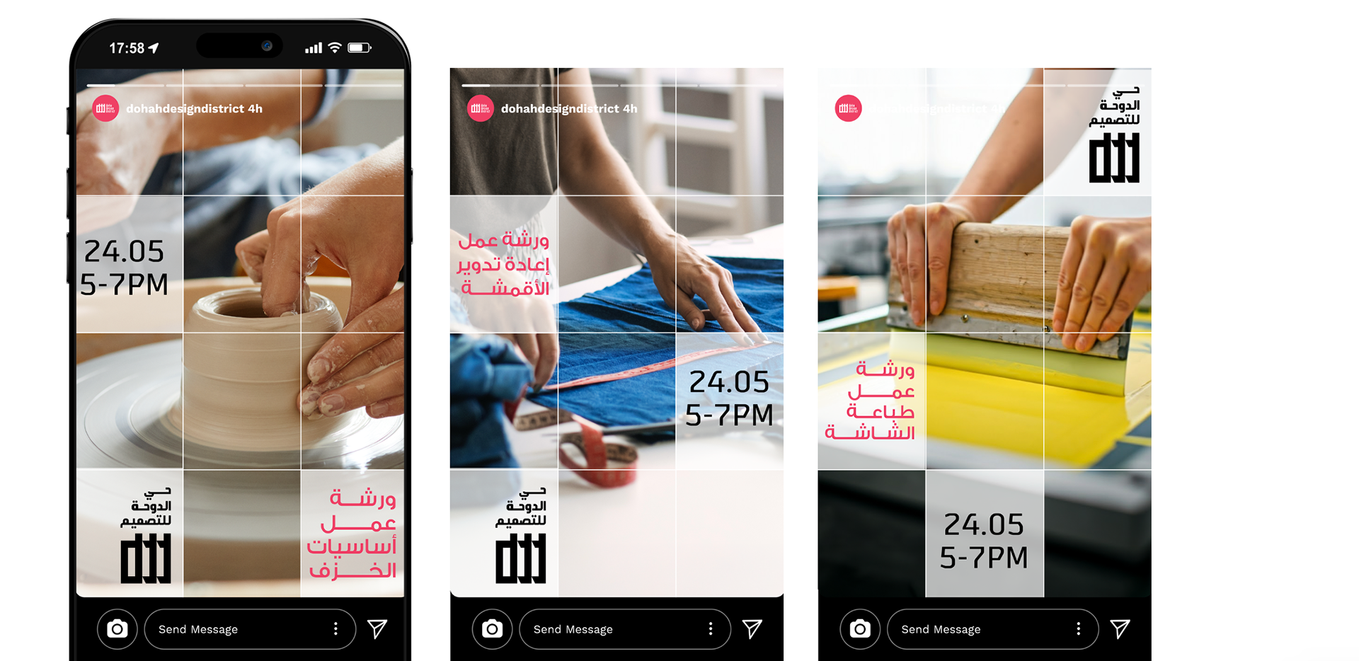
In this direction, we utilize a grid layout to structure and organize information, dividing the image and text into equal sections that also mimic the shape of the logo's emblem.
The grid is simultaneously abstract and ordered- enabling the audience to easily retain the information in a playful and concise way.
Workshops
Events
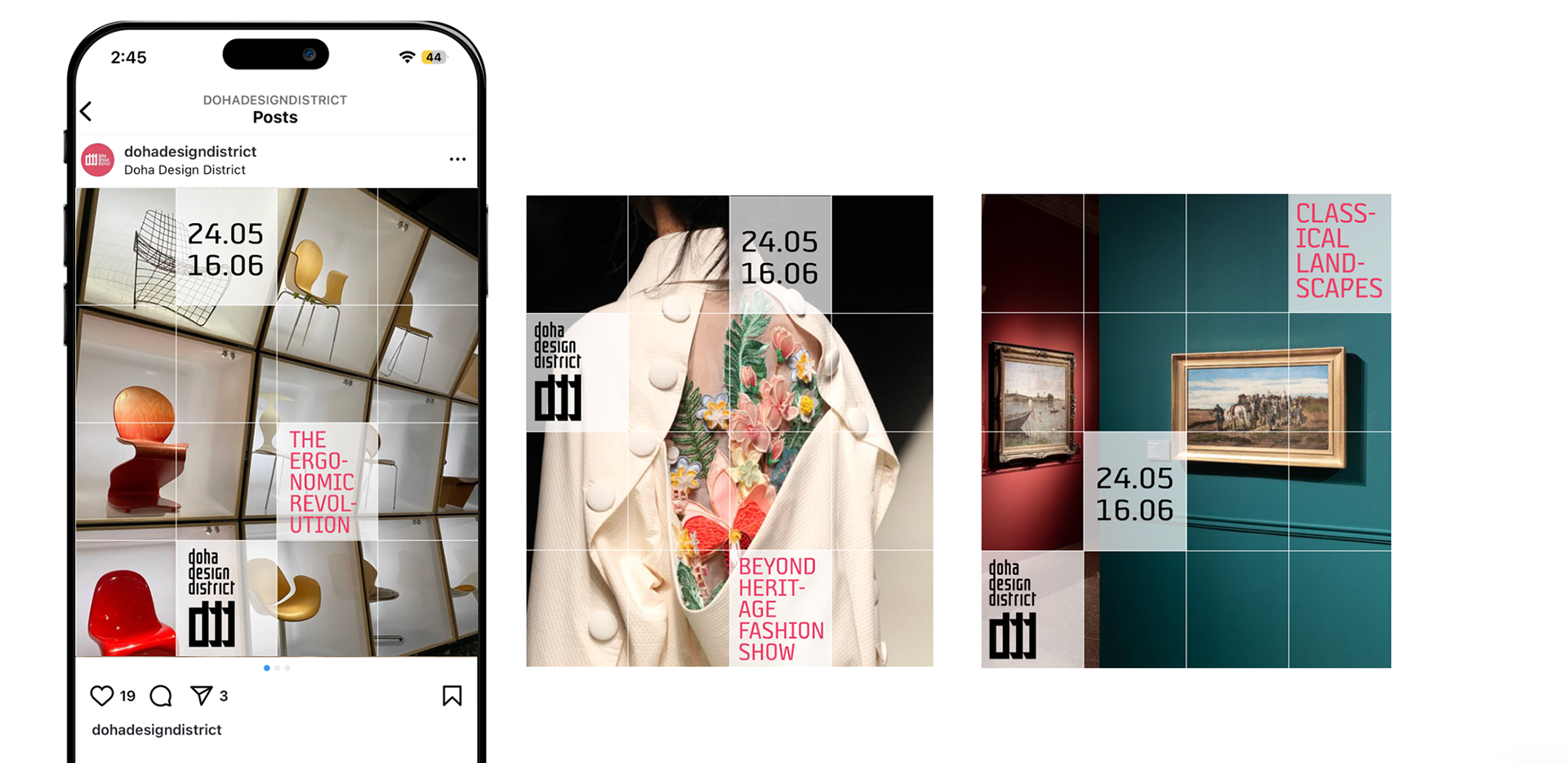
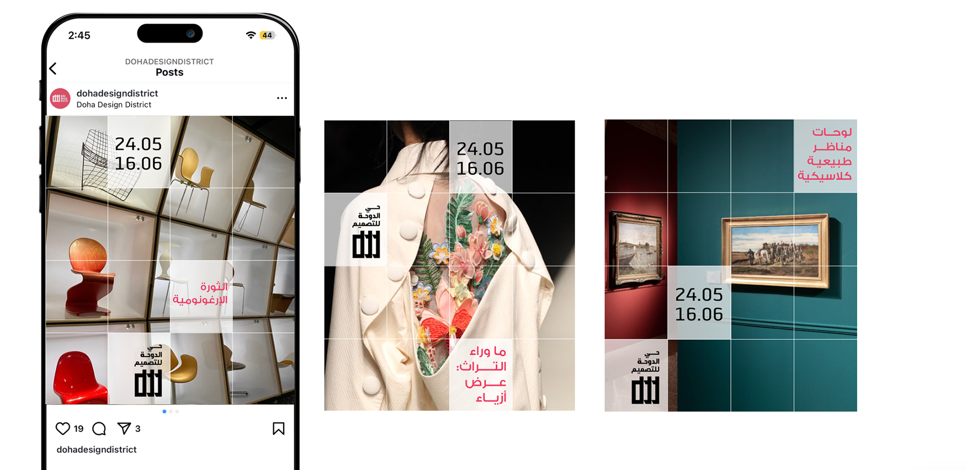
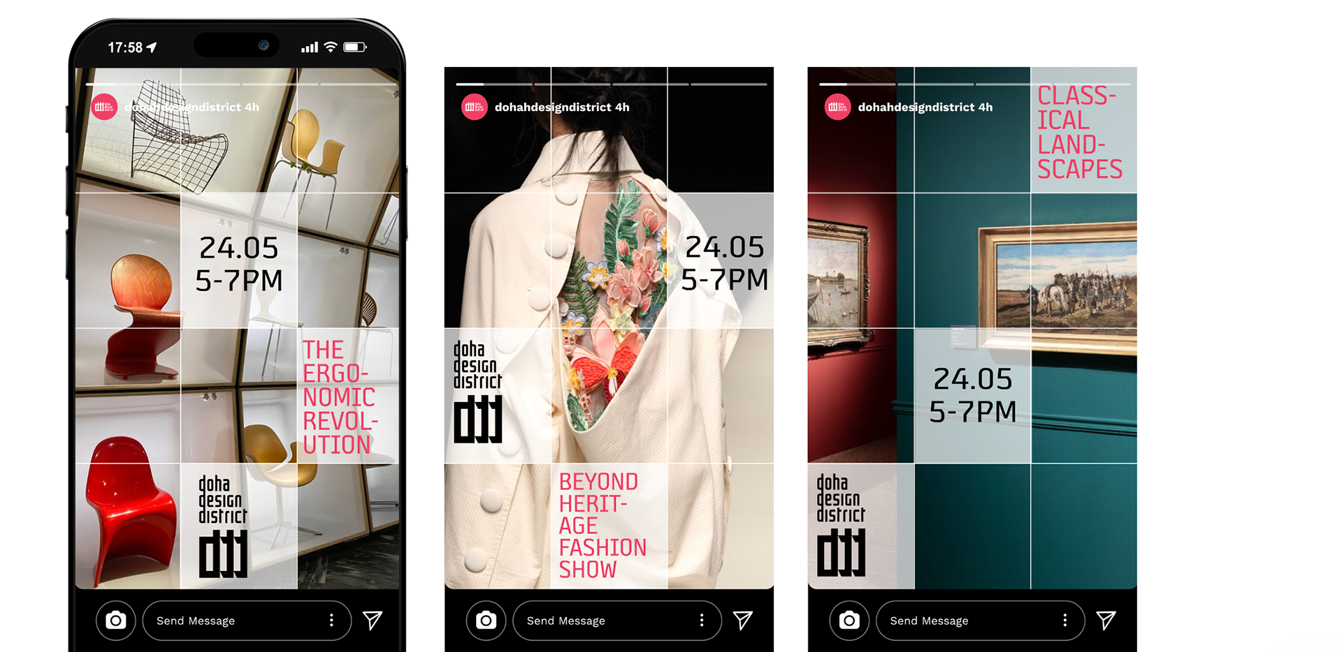
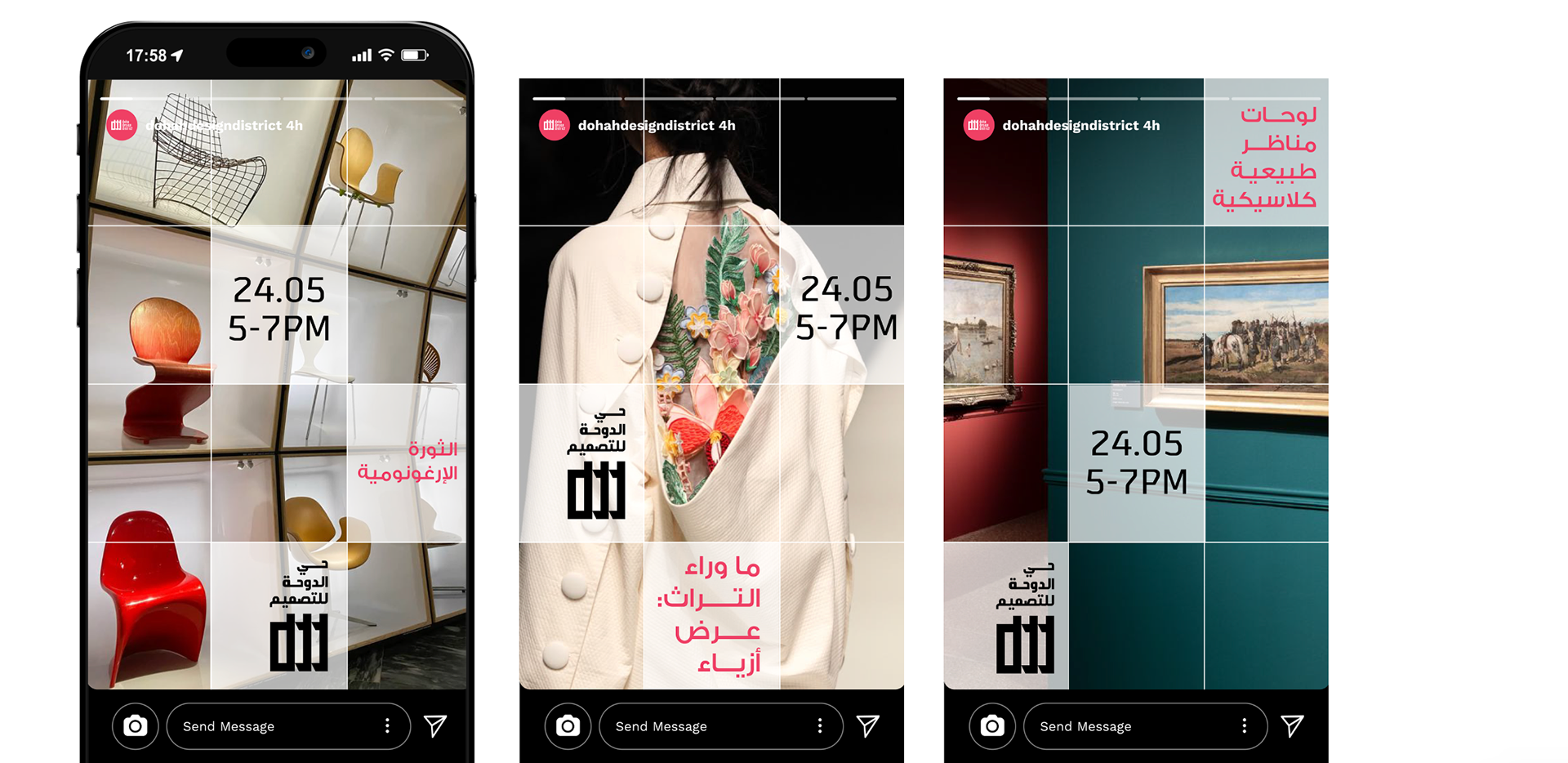
D4 Overview