Pronto is a digital space and a virtual movement that aims to connect talented young designers with the fashion community.
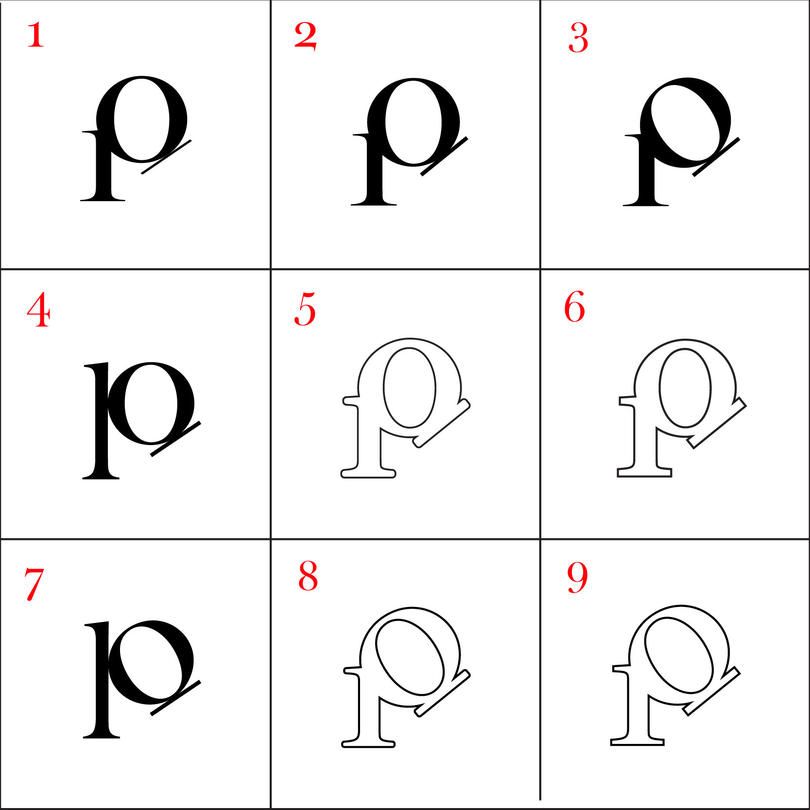
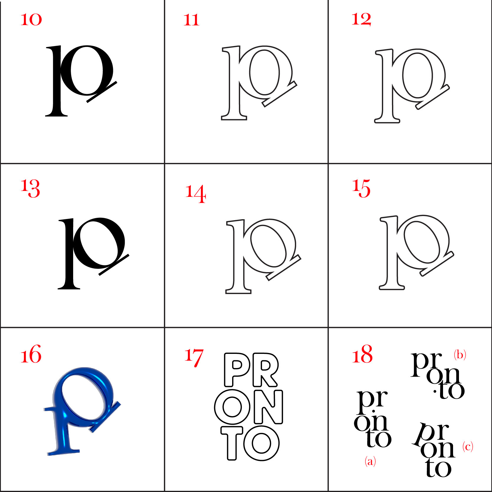
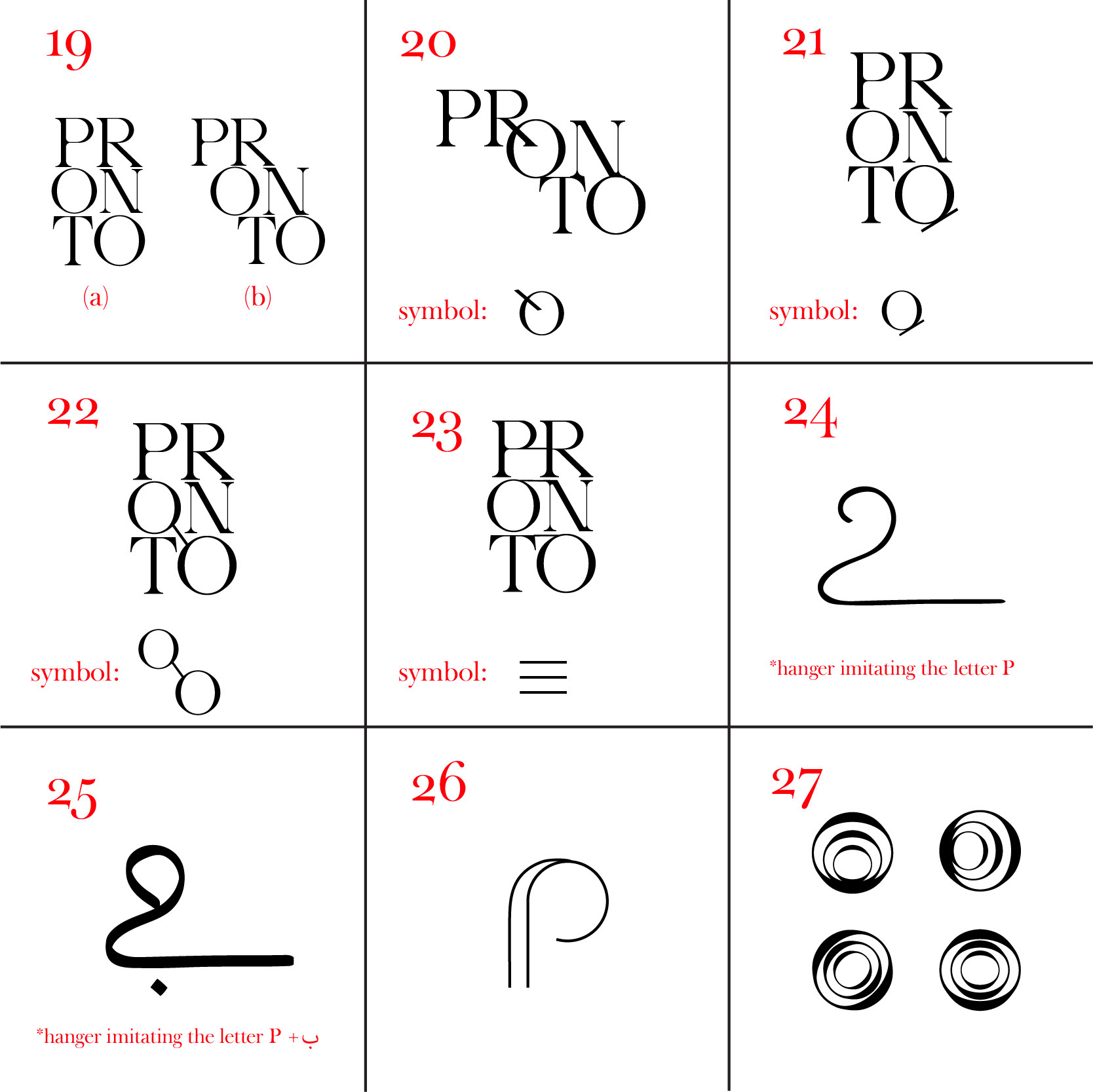
Bearing in mind that the company is centered on local fashion, I created a symbol that subtly highlights that by illustrating the letter p in the form of a clothing hanger and the letter ب (p in Arabic) when rotated.
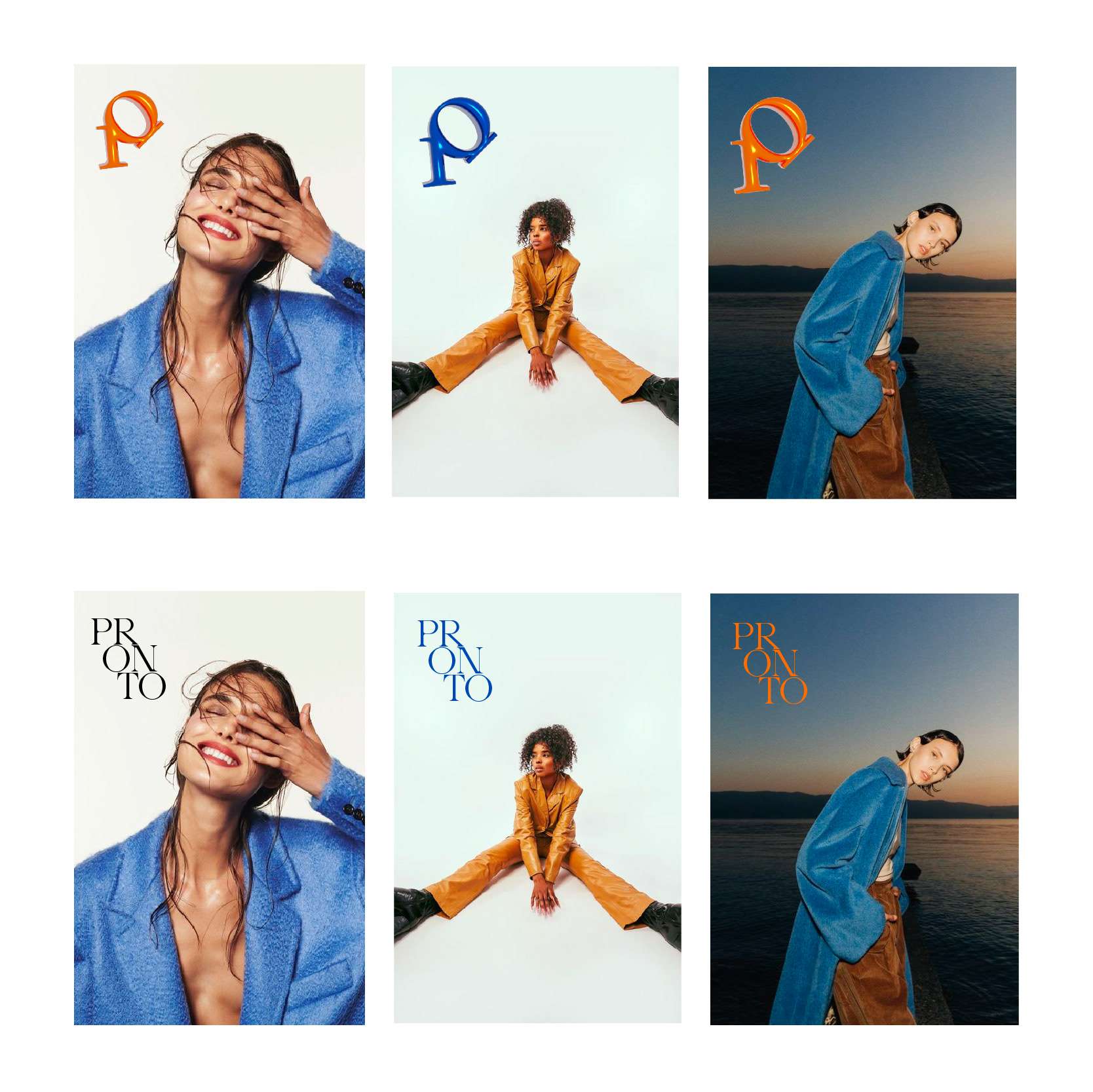
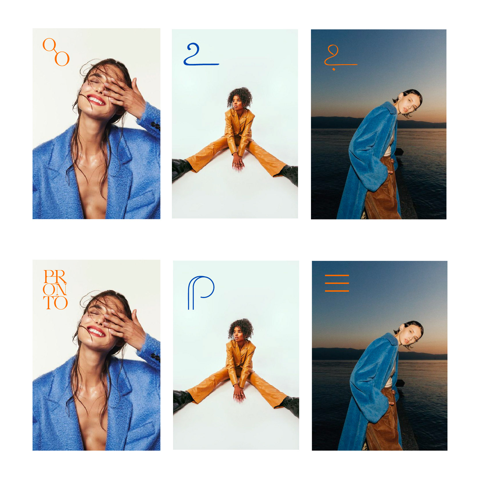
Wordmark, symbol and slogan:


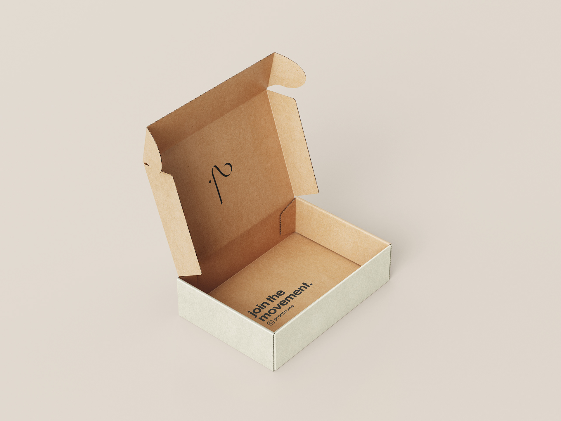
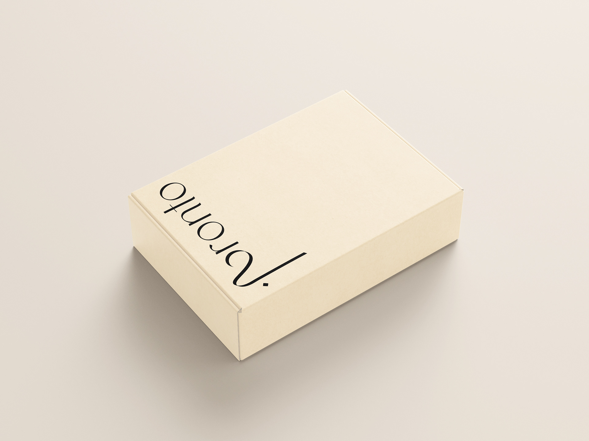
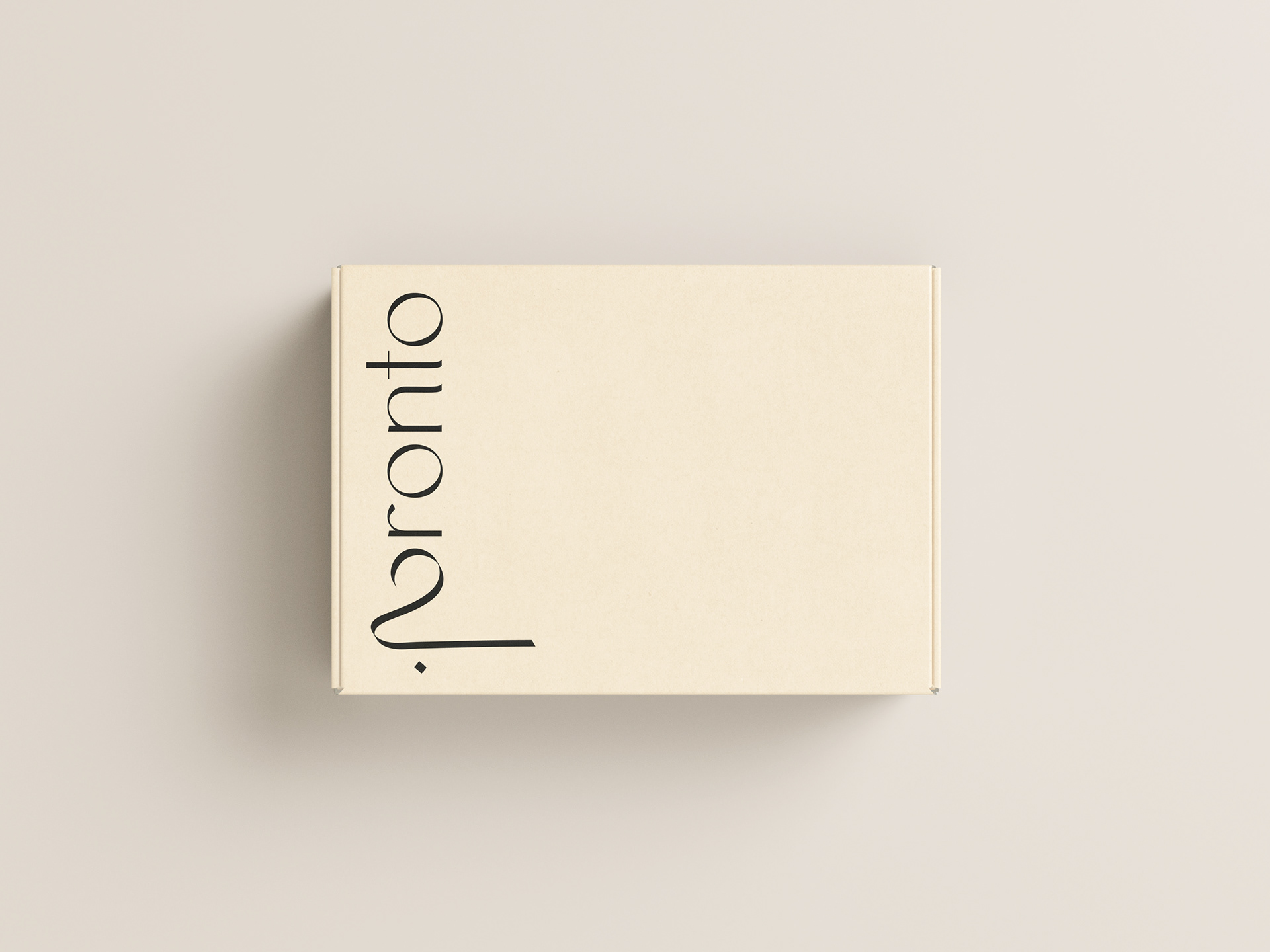
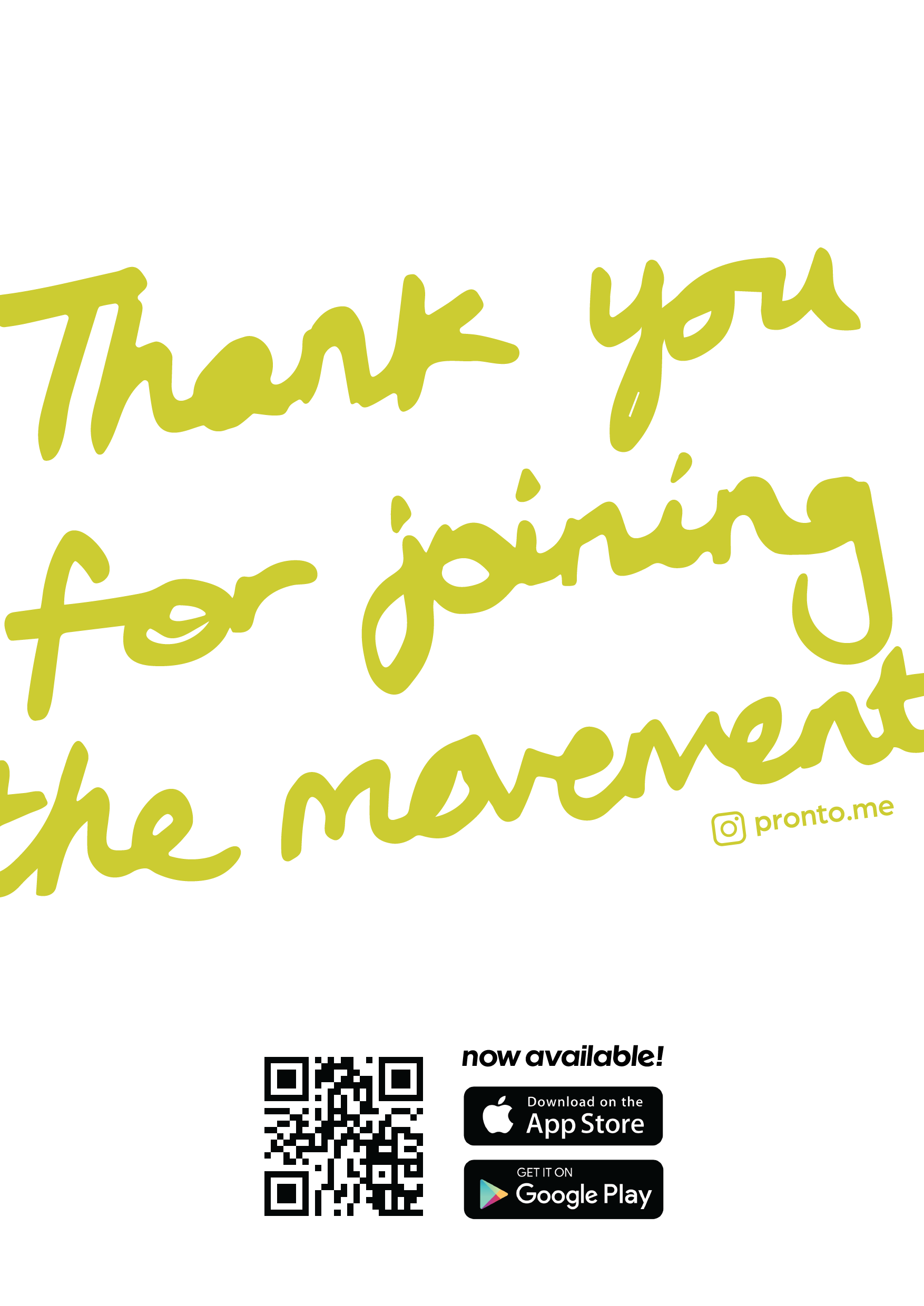
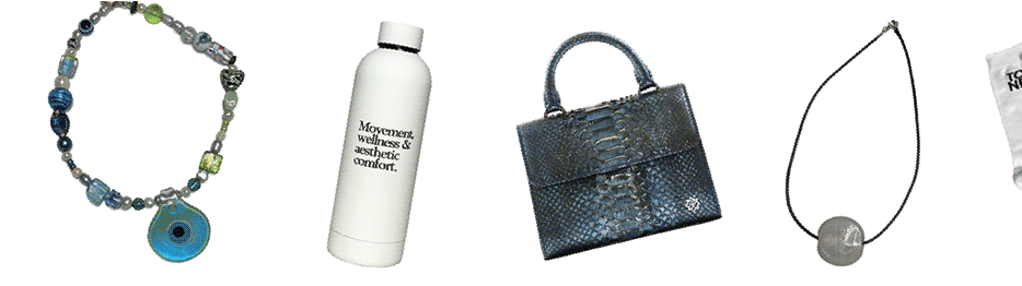
Brand packaging and Thank you card

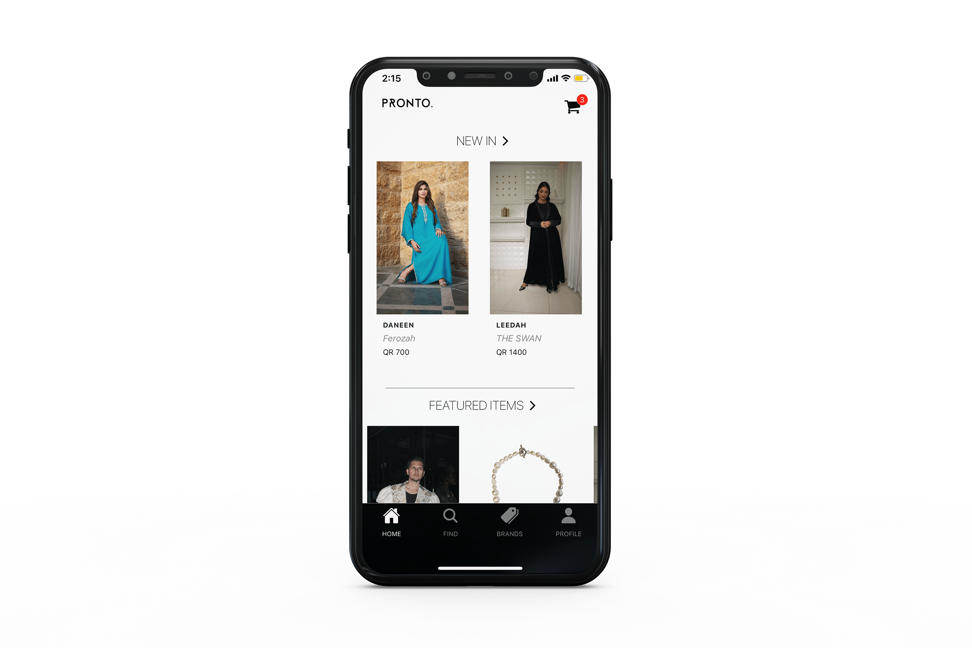
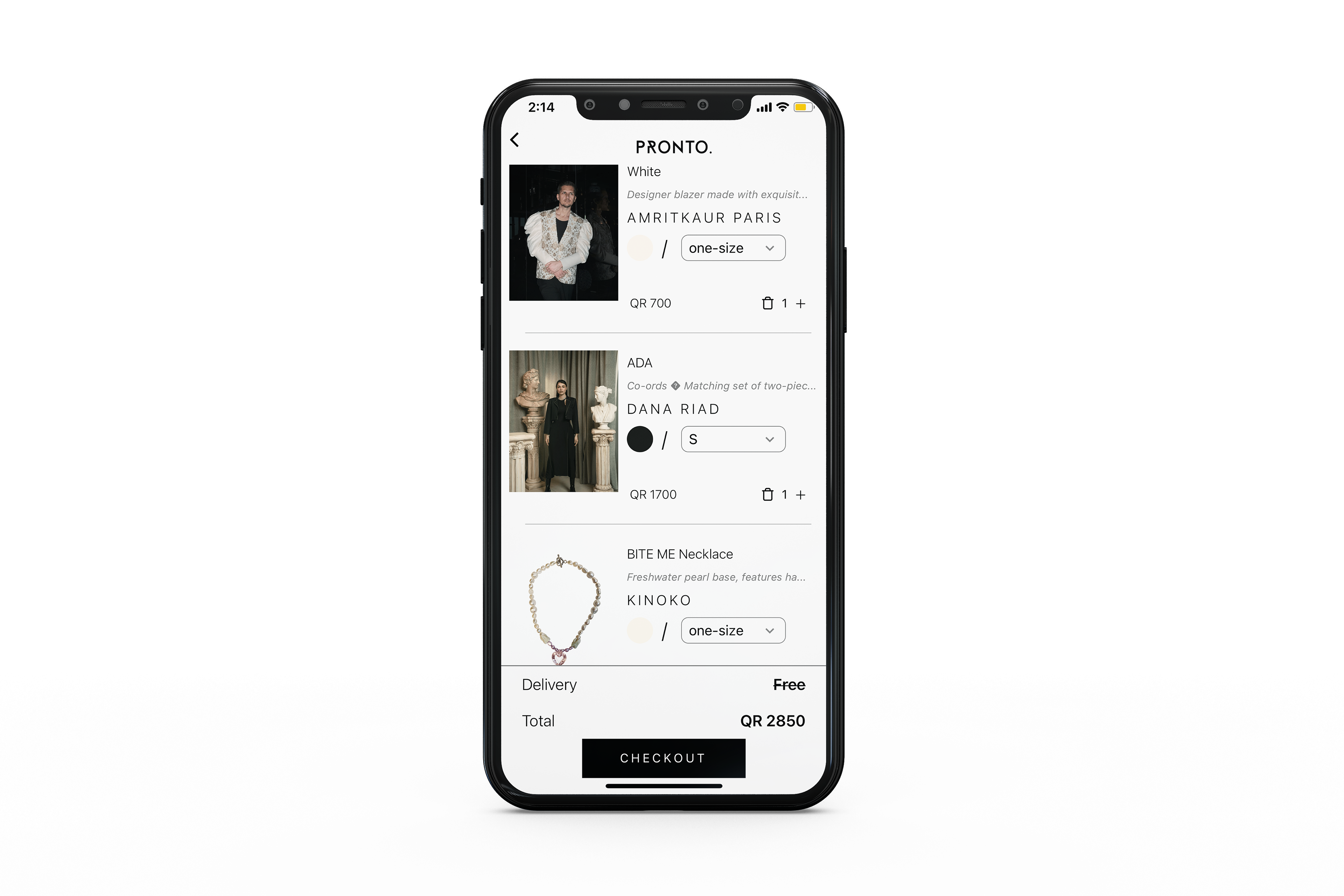
APP DESIGN
Previous version of the app:
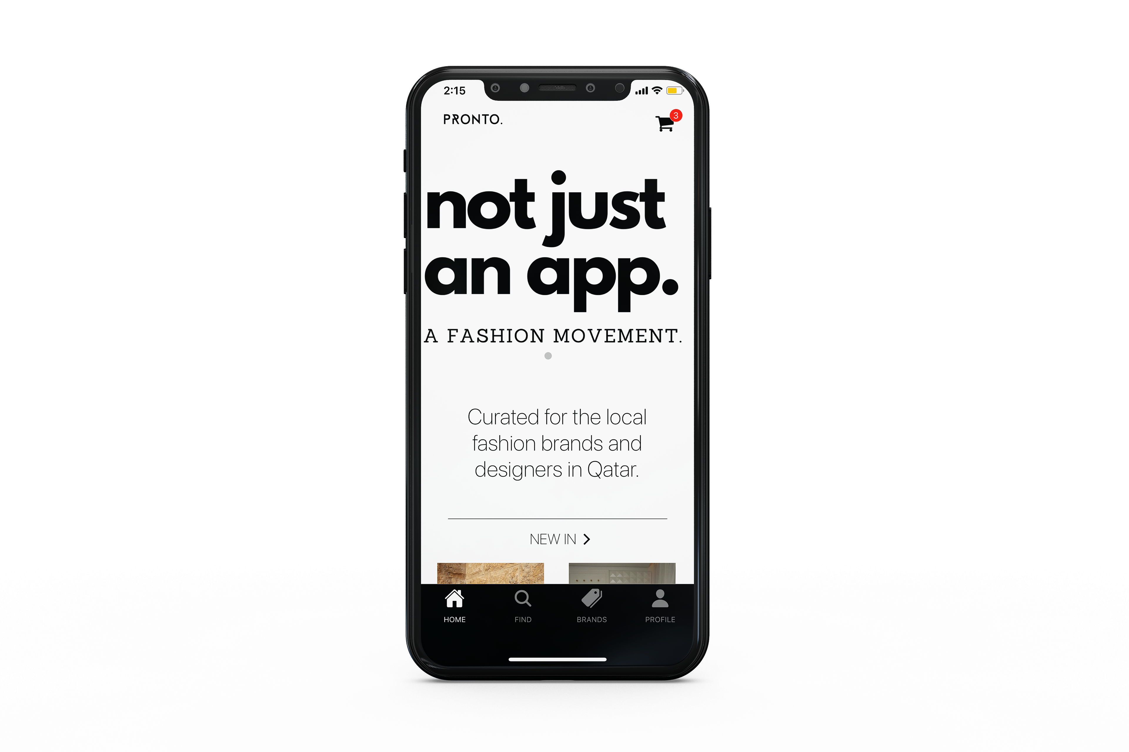

Mockups created to pitch in changes required for the app's aesthetic and user interface. Includes typefaces, spacing, icons, visuals, overall layout, and toolbar (not included here).
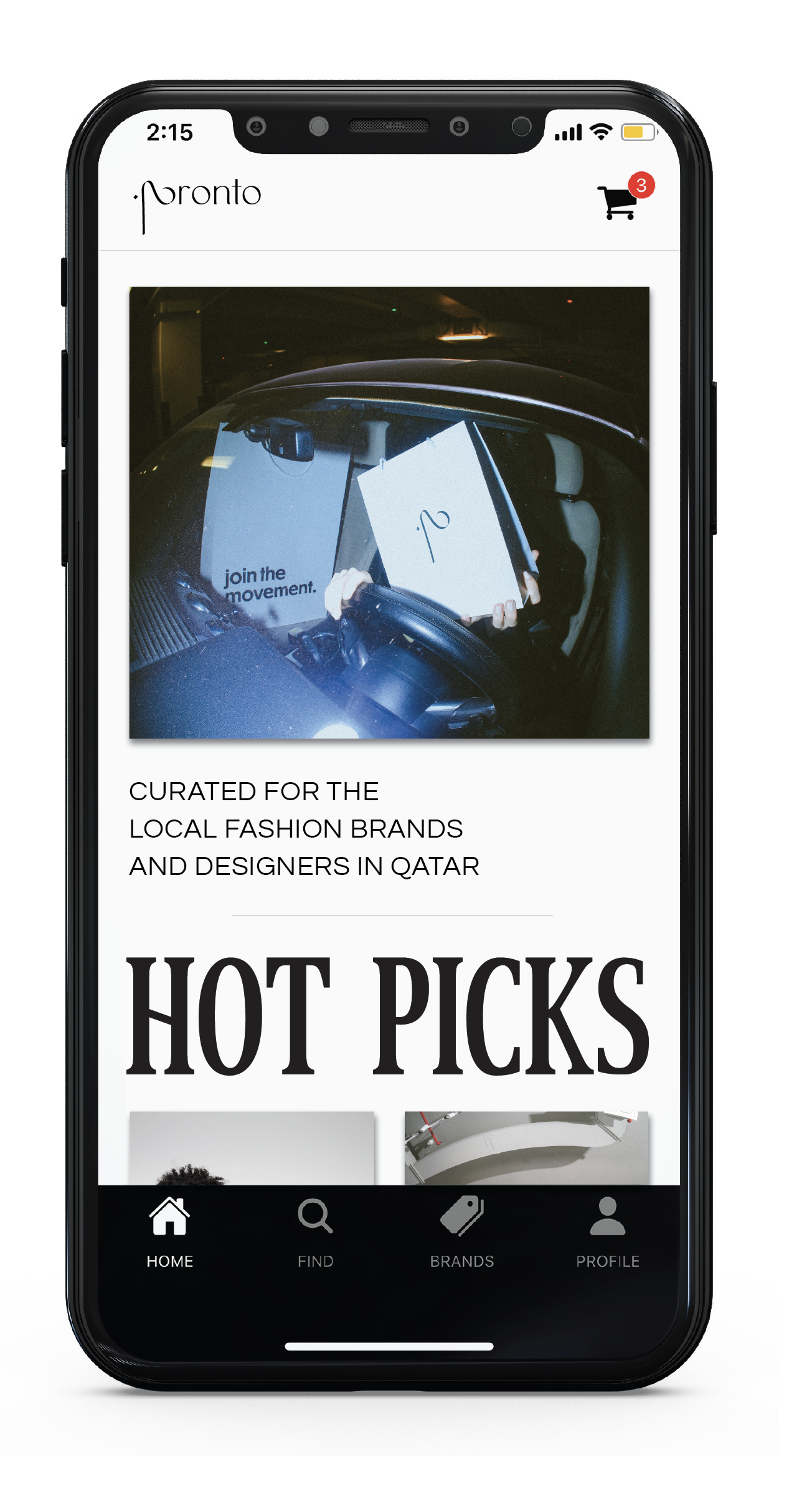
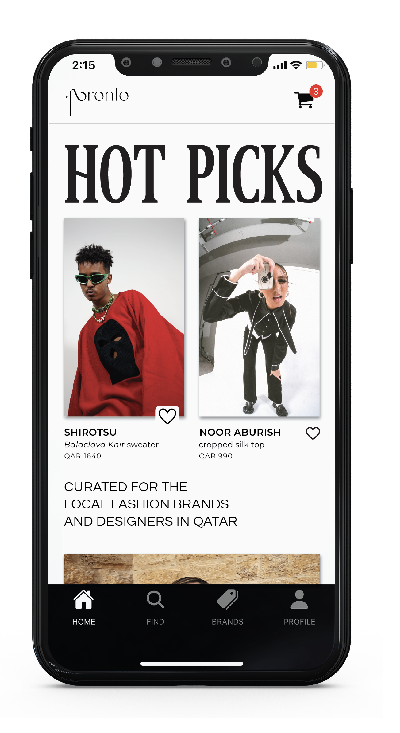
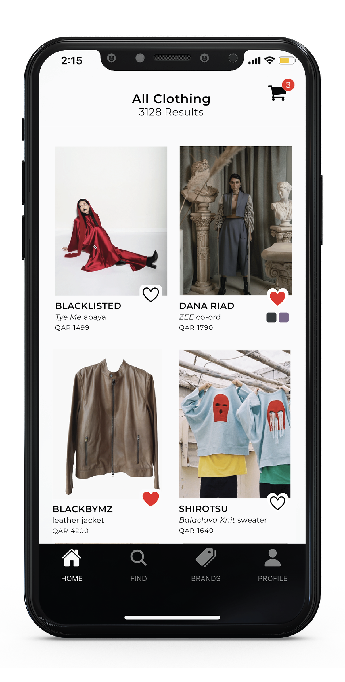
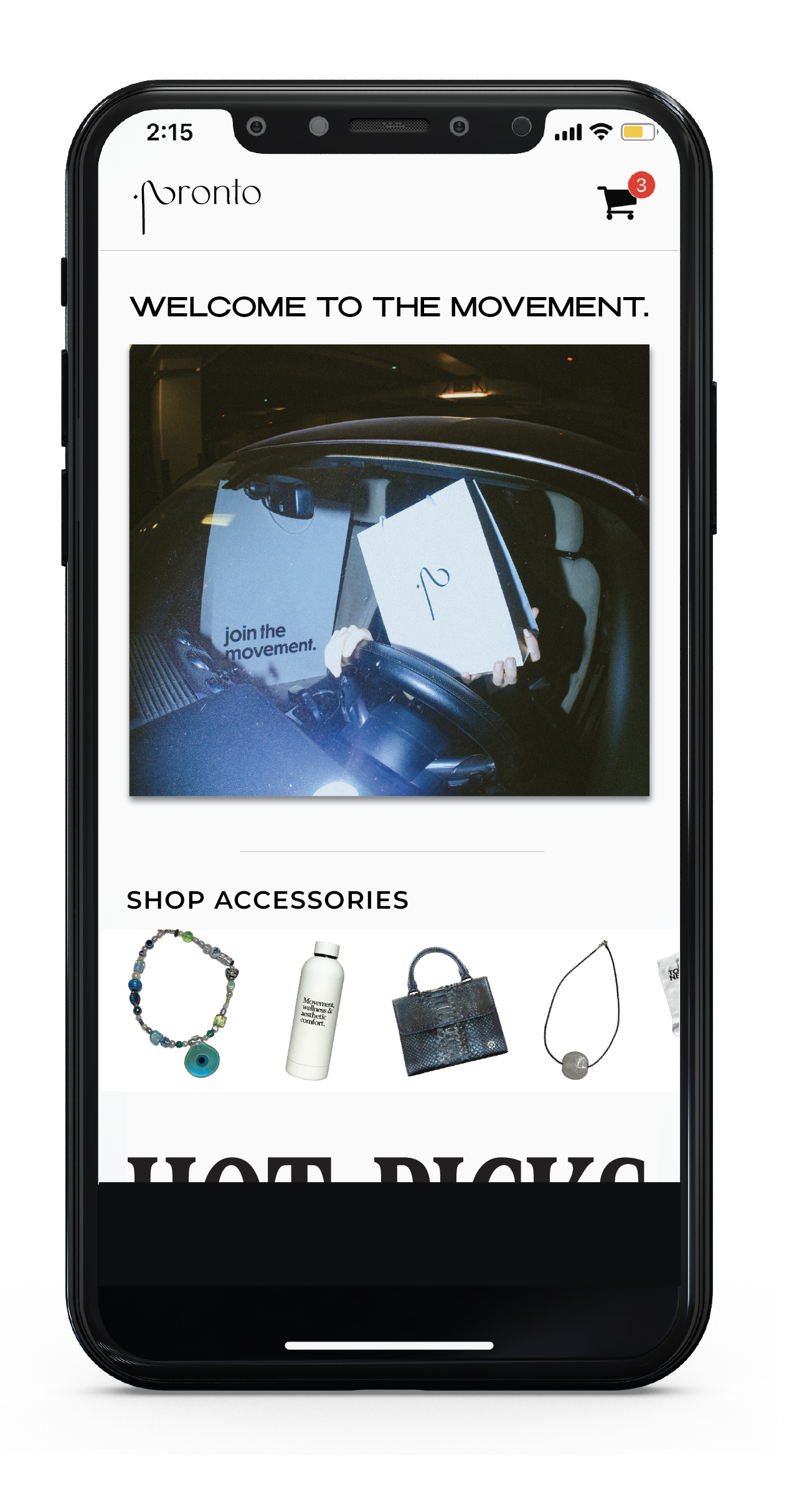
Screenshots of current app version in which I designed engaging visuals that reflect on the app's experimental identity:


Screenshots of visuals designed for the preview of the app on the Apple Store:
(scroll to the top of this page to view in real time)


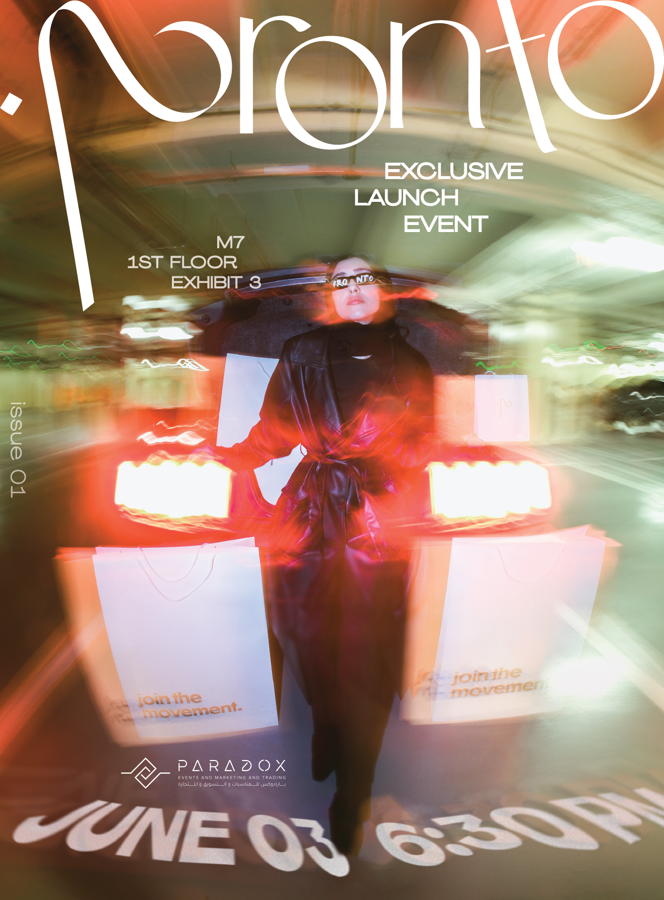
Digital invitation for the launch event/exhibit showcasing local brands and promoting application
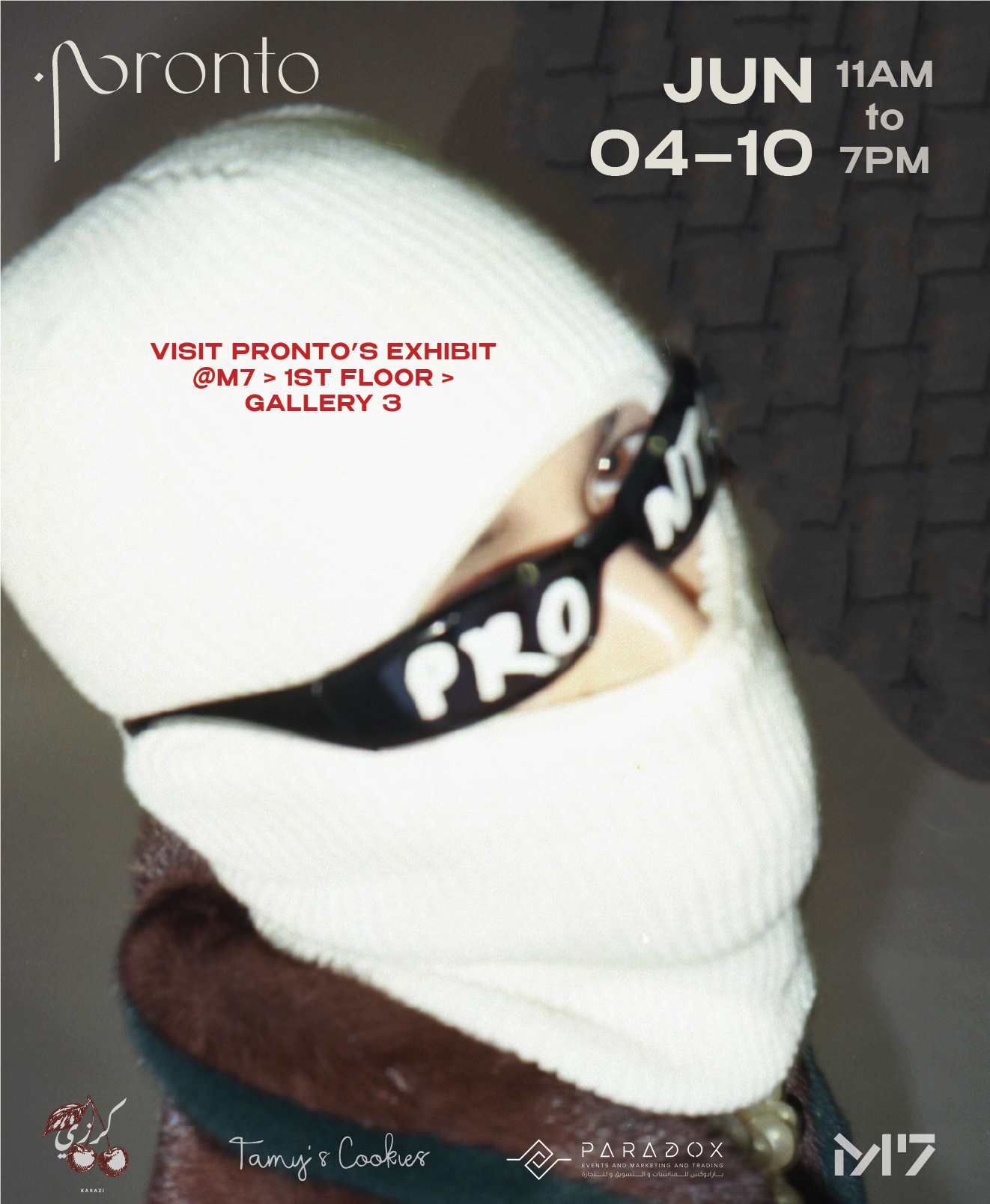
Post created for social media promoting the exhibit
PROCESS OF THE LOGO DESIGN + IMPLEMENTATION